Por qué "retro" y "cinemático" no son suficientes
La mayoría de los prompts de estilo para imágenes IA fallan de una de dos maneras. La primera es el lenguaje vago: "hazlo retro", "hazlo lindo", "hazlo cinematográfico" o "hazlo colorido". Esas frases suenan útiles, pero no le dan al modelo una superficie estable que reproducir. La segunda es el lenguaje demasiado prestado: usar el nombre de un estudio protegido, el nombre de un artista vivo, un personaje específico o un título famoso como referencia de estilo. Puede producir un look familiar, pero genera riesgo en la revisión y debilita la originalidad.
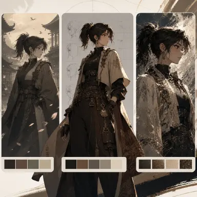
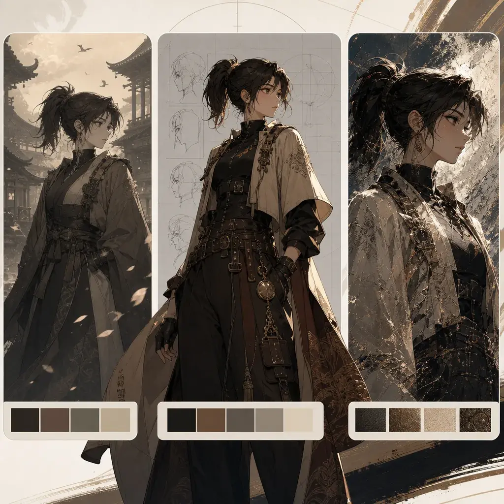
Un método más seguro y repetible es la fórmula de estilo: era, sistema de referencia y textura. La era ubica la imagen en un período visual amplio. El sistema de referencia describe un lenguaje de medios neutro, como retrato de revista de moda, captura de animación cel, boceto de diario de viaje, panel de álbum de cómics o escena de sprite de juego retro. La receta de textura nombra la superficie, el comportamiento de la línea y la paleta de colores.
Esta fórmula es especialmente útil para los creadores de personajes originales. Tu OC puede seguir siendo tuyo mientras se mueve por diferentes tratamientos visuales. En lugar de pedir el look de un estudio conocido, puedes pedir "animación pastoral de acuarela cálida" con papel de prensa frío y rugoso, línea de lápiz suave en sepia, capas de lavado transparente y una paleta de campo específica. Usa Warm Watercolor Pastoral Animation como ejemplo de style-pack.
Qué hace cada parte de la fórmula
La primera parte es la era. Era no significa copiar un título. Significa nombrar un período de diseño amplio o un momento mediático: anime de la burbuja de los 80, animación cel de los 90, fotografía callejera Y2K, cómics de semitonos de periódico o pantallas de videojuegos pixel de los primeros años. La era le da al prompt lógica de vestuario, densidad de imagen, hábitos de iluminación y expectativas de composición.
La segunda parte es el sistema de referencia. Este es el contenedor neutro del estilo. "Retrato de revista de moda" le indica al modelo que se preocupe por la pose, la ropa, la suavidad del objetivo y el pulido de la página. "Ilustración de diario de viaje" le indica que se preocupe por las notas de ubicación, el grano del papel, la línea de tinta y los espacios de acuarela. "Panel de álbum de cómics" le indica que se preocupe por la línea de contorno, la arquitectura y la acción narrativa legible. Esto es más seguro que nombrar una obra protegida como referencia.
La tercera parte es la textura. La textura es donde vive la mayor parte de la calidad del prompt. Una receta de textura útil tiene tres capas: superficie base, comportamiento de línea o pincel, y paleta. Por ejemplo: "papel de algodón crema con textura como base; trazos expresivos de fineliner cobalto y bordes de lavado de acuarela sueltos; paleta de ocre cálido, oliva apagado, terracota polvorienta y azul cielo lavado". Esa frase se puede reutilizar con muchos personajes porque describe materiales, no propiedad.
Cómo escribir una receta de estilo reutilizable
Empieza eligiendo una era amplia. Mantenla neutra y descriptiva. "Anime de la burbuja de los 80" es más seguro y claro que usar el título de un show específico. "Animación pastoral de acuarela cálida" es más seguro que el nombre de un estudio protegido. "Cómic retro en papel de periódico" es más seguro que una famosa franquicia de superhéroes.
Luego, elige el contenedor visual. Pregúntate cómo debería sentirse la imagen final como objeto: página de revista, captura de cel, foto callejera instantánea, boceto de libreta, página de libro infantil, panel de álbum de cómics, pintura al óleo o escena de juego pixel.
Después, escribe las tres capas de textura. La base podría ser papel de revista marfil, cel de acetato sobre papel de animación, papel de algodón crema, papel xuan en bruto, lienzo de lino, vidrio esmerilado o papel de periódico amarillento. La capa de línea podría ser contorno de tinta preciso, línea digital afinada, interrupciones de pincel seco, contorno de lápiz redondeado, bloques de pixel gruesos o tinta de pincel en negrita. La paleta debe usar nombres de colores exactos, no afirmaciones vacías. Evita las afirmaciones generales de color o detalle; no le dicen al modelo qué preservar.
Finalmente, coloca la receta dentro de una estructura de prompt más amplia. Una receta de estilo sola no es suficiente. Todavía necesitas sujeto, ropa, composición, fondo y restricciones negativas. Compara esa estructura con Ink Watercolor Travel Journal.
Ejemplo 1: moda anime de la burbuja de los 80
Render Mira as an 80s bubble-era anime fashion portrait: an original city courier with short black hair, amber eyes, a small silver ear cuff, and a calm confident expression.

Subject character: Mira, original character, short black hair, amber eyes, silver ear cuff, narrow smile.
Outfit: late-80s urban fashion mood, cropped cream blazer, carmine silk scarf, petrol-blue pleated trousers, polished loafers, no copied logos.
Composition and pose: half-body fashion magazine pose, shoulders angled, one hand adjusting the scarf, direct eye contact.
Background environment: clean studio wall with a distant night city window shape, no readable signage.
Light, color, and style: warm ivory magazine stock with faint emulsion specks as the base; precise black contour ink, soft airbrushed cheek color, and restrained film grain; palette of champagne beige, carmine red, petrol blue, and pearl gray. Use elegant rim light and a slightly softened lens feel.
Negative constraints: no protected studio or artist imitation, no copied character, no attribution captions, no readable text, no logo, no photorealistic skin, no extra fingers.
Este prompt usa la era para el vestuario y la pose, el sistema de referencia para el encuadre de revista y la textura para la superficie reproducible.
Ejemplo 2: diario de viaje en tinta y acuarela
Render Eren in an ink-and-watercolor travel journal scene: an original young mapmaker with curly auburn hair, round glasses, a navy satchel, and a careful curious expression.

Subject character: Eren, original traveler, curly auburn hair, round glasses, navy satchel, careful curious expression.
Outfit: practical travel clothes, sand linen shirt, muted olive scarf, rolled sleeves, brown walking shoes, no branded patches.
Composition and pose: three-quarter figure seated on a stone step, sketching a bridge in a small notebook, satchel resting beside one foot.
Background environment: old canal bridge, potted herbs, narrow guesthouse doorway, small awning shapes, no readable labels.
Light, color, and style: textured cream cotton paper as the base; expressive cobalt fineliner linework, uneven ink pauses, and loose watercolor wash edges; palette of warm ochre, muted olive, dusty terracotta, and sky-wash blue. Leave small unpainted paper gaps.
Negative constraints: no protected artist imitation, no copied postcard, no attribution captions, no readable text, no stamps, no logo, no photorealism.
La receta de textura mantiene el estilo incluso si la ciudad, la pose o el personaje cambian.
Ejemplo 3: diseño de personaje futuro de cristal
Render Sol in a glass-future character design: an original orbital archivist with silver bob hair, gray eyes, a clear ear device, and a quiet analytical expression.

Subject character: Sol, original character, silver bob hair, gray eyes, clear ear device, composed expression.
Outfit: clean futuristic outfit, translucent jacket panel, smooth graphite bodysuit layer, modular opal collar, simple seams, no copied insignia.
Composition and pose: three-quarter full-body stance, one hand touching a floating abstract light panel, face turned toward the viewer.
Background environment: quiet orbital lounge with glass balcony arcs and soft planet-light shapes, no readable UI text.
Light, color, and style: frosted translucent glass panels as the base; clean luminous edge lines, soft caustic blur, and polished acrylic reflections; palette of glacier blue, opal white, prism pink, and graphite gray. Use airy light and transparent layering without visual clutter.
Negative constraints: no protected product or artist imitation, no copied sci-fi uniform, no attribution captions, no readable interface text, no logo, no busy wires, no dark cyberpunk grime.
Este ejemplo muestra que una fórmula de estilo también puede funcionar para imágenes futuristas. No necesita nostalgia para ser específica.
Los errores más comunes
El error más grande es usar el nombre de un artista o estudio como atajo. Puede parecer eficiente, pero no es un método de producción reutilizable. Además, te da menos control sobre qué debería cambiar y qué debería mantenerse original.
Otro error es escribir palabras de paleta demasiado amplias. "Brillante", "oscuro", "suave" y "colorido" no son suficientes. Nombra los colores.
Los creadores también mezclan demasiados sistemas de referencia en un solo prompt: foto de revista, diario de acuarela, captura de cel y pintura al óleo al mismo tiempo. Elige un contenedor por imagen.
Finalmente, no olvides las restricciones negativas. Un buen prompt de estilo debe bloquear texto legible, logotipos, símbolos copiados y nombres protegidos.
Preguntas frecuentes
¿Puedo mencionar una era sin nombrar una obra específica?
Sí. El lenguaje de era amplio suele ser útil: anime de la burbuja de los 80, animación cel de los 90, retrato callejero Y2K o cómic retro en semitonos de periódico. Mantén el lenguaje descriptivo en lugar de basado en títulos.
¿Qué hace que una receta de textura sea reutilizable?
Que nombra la superficie base, el comportamiento de línea o pincel y la paleta de colores. Si esa frase sigue funcionando después de reemplazar el personaje, es reutilizable.
¿Todo prompt de estilo debe incluir un bloque negativo?
Sí. Los prompts de estilo son especialmente propensos a añadir texto, logotipos, símbolos copiados o señales visuales famosas. Un bloque negativo corto mantiene la revisión más segura.