Why Descriptive Words Can't Set a Mood
You make an anime short about two sisters arguing in a rooftop greenhouse. The first shot lands: green glass, warm sunset, one sister hiding behind hanging vines. Then the next generated shot turns the scene icy blue, the apology shot goes neon purple, and the ending becomes golden for no story reason. Every frame looks polished by itself, but the emotional path feels like someone shuffled filters. This guide shows you how to keep every shot's color choice tied to the story, from first draft to final render.
That is the color-emotion problem. In anime prompts, color should not be a decoration word you add at the end. It is a story signal. It tells the viewer where safety lives, where tension enters, when intimacy becomes possible, and when the scene releases pressure. If the palette changes randomly, the audience feels drift even when the character design stays stable.
Color rules hold up when they're anchored the same way everything else is: bind the identity colors into the character asset in My Assets, and every later shot pulls them in with a single @ reference instead of you retyping them each time. Start with Style Templates when you need a reusable look. Use Color Specification for Character Assets to lock identity colors, and keep the scene beats in ArcLoop Worlds when the palette has to carry through a series.
This guide shows how to build an emotion palette map, assign colors to story functions, preserve color continuity, and revise only the layer that fails.
Rules for Assigning Colors to Story Functions
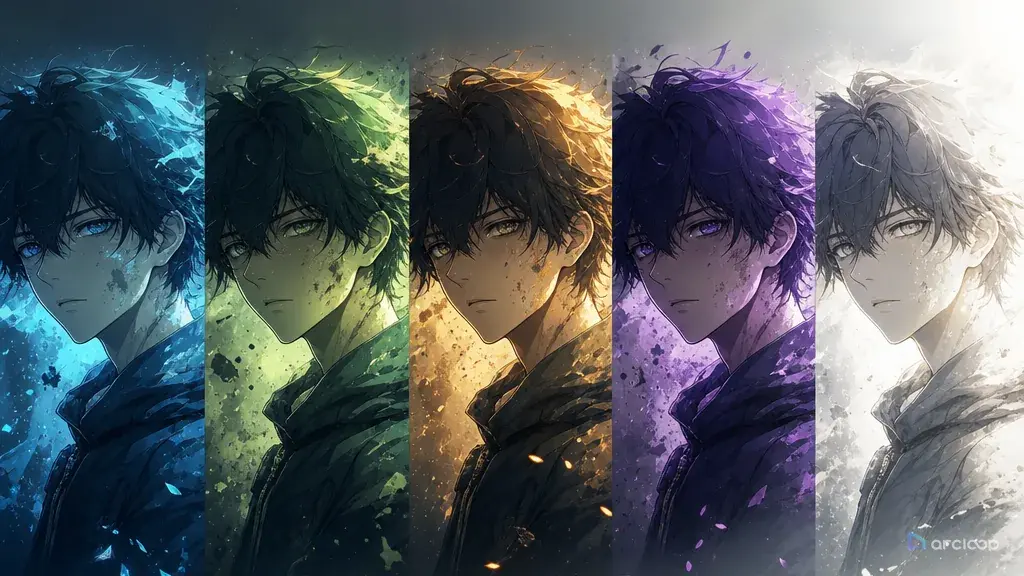
Give every major color a job. Amber can mean safety, hospital green can mean unease, washed lavender can mean distance, and clean morning white can mean release. The exact choices are yours, but the mapping has to be deliberate. Otherwise the model treats color as surface polish.
Separate character colors from scene emotion. A character's red jacket may be an identity anchor that stays stable across moods. The lighting around that jacket can shift from sickly green to warm orange. If you do not separate those layers, the output may recolor the costume when you only meant to change the room.
Use contrast to show emotional pressure. Two characters in the same frame can carry different color worlds: one lit by the vending machine's cold blue, the other by a noodle stall's warm lantern. The contrast tells the viewer what is unresolved.
Limit the palette per shot. A short anime clip does not need eight emotional colors. Pick one base color, one pressure color, and one accent. A tight palette usually survives generation better than a rainbow of intentions.
Plan the transition, not just the final mood. If a scene moves from suspicion to trust, describe the color shift over time: green fluorescent flicker softens into warm window bounce, or red alarm light fades as dawn enters. Motion in color can be as important as motion in the body.
Review color at thumbnail size. If the emotional signal disappears when the shot is small, the palette is too subtle or too busy. The viewer should feel "safe," "wrong," "lonely," or "released" before parsing small details.
How to Build a Color Emotion Prompt: From Beat to Final Shot
Start by naming the emotional beat. Do not write "beautiful colors." Write "the scene begins suspicious and ends with a fragile apology." This gives the palette something to do.
Build an emotion palette map. Use a small table with five columns: emotion, color family, light source, where it appears, and what must not change. For the rooftop greenhouse scene, safety might be warm sunset on skin, tension might be green glass shadows, and release might be a soft peach reflection on both sisters.
Lock character identity colors separately. Hair color, eye color, outfit color, and signature accessory belong in the character asset. Use Color Specification Character Asset when a recurring character needs exact color anchors across episodes.
Write the shot prompt with color placement. Instead of "moody blue and orange," say where the colors live: blue vending machine light behind the older sister, orange noodle stall light on the younger sister's hands, neutral shadow between them. Placement creates story.
Add timing for color changes. For a 6-second clip, one transition is enough. Example: the red emergency light blinks twice, then a steady white repair lamp turns on when the character chooses to tell the truth.
Generate a small batch of variants and reject random palettes early. If the identity colors drift, fix the character asset or prompt anchors. If the mood is wrong but identity is stable, revise only the lighting and palette instructions.
Save the approved swatches as visual references in My Assets — as mood references — instead of leaving them as one-off notes. The next shot should reuse the same emotional logic, not the exact same color everywhere. Consistency means "amber equals safety" keeps working, not that every scene becomes orange.
Once you've settled on the palette map, treat it like a project asset instead of a note you keep re-reading. In My Assets, create a Visual reference and save the final color-to-emotion image there — the one showing which color belongs to which story beat. Bind reference images for Nami and Orelle to their own character assets first, so hair, hoodie, and cardigan colors stay locked separately from the mood palette. Then open the episode, go to Storyboard, and click Generate Shots to break the scene into shot cards. In each shot card, pull in @Nami and @Orelle for identity, and keep the shot card text itself narrow: only the light source, the color entering or fading, and when it happens in that one shot. Generate the still image first and check the palette reads correctly before you generate video. When several shots in the scene need the same color pass, use the AI Chat Panel — "Generate videos for Shots 2, 3, and 4" — then compare takes and reorder them on the Edit timeline.
Keep Color Rules in Visual References, Not in the Prompt
Color emotion is easier to control once it lives in the same place as the rest of the project instead of in memory. Keep mood swatches as visual references in My Assets, next to the storyboard beats they apply to, so every shot description can point back to the same story function. Keep the character asset separate, so identity colors never get overwritten by a mood choice made for one scene.
Use Warm Watercolor Pastoral Animation only when it matches your project. Adapt the palette rules to your story instead of copying a visual reference wholesale.
When generating, compare three outputs side by side: one that best preserves character colors, one that best carries emotional color, and one that has the clearest action. The chosen take should not win on color alone. It still has to read as an anime shot with stable identity, readable motion, and a clear beat.
For revisions, use a narrow request. "Make it more emotional" invites random saturation. "Keep the sisters' outfits unchanged, reduce green spill on faces, and let warm sunset touch both hands only after the apology gesture" gives the regenerated shot a narrow, specific target instead of an open-ended mood note.
Example 1: Emotion Palette Map for Rooftop Greenhouse Sisters
Establishing shot for a Visual reference in My Assets: the rooftop greenhouse where @Nami and @Orelle argue after Nami hides a scholarship letter. Static wide angle down the greenhouse aisle, hanging vines crossing the top of frame. Nami stands near the vines on the left, Orelle stands beside the wet potting table on the right. Light splits the space into three zones: warm sunset amber across the right floor for safety, green glass shadow over the left wall and table for tension, and a soft peach glow bridging the center where their hands will later meet. Nami's coral hoodie and Orelle's green cardigan stay visible but unlit — the emotional colors live in the environment, not the costumes.
This prompt creates the map before asking for a finished clip. It protects identity colors while giving the scene lighting a story job.
Example 2: Color Emotion Shot Prompt
Medium two-shot inside the greenhouse aisle: @Nami and @Orelle, hanging vines crossing the top of frame, both faces and hands visible. Nami grips a folded scholarship letter behind her back, then slowly sets it on the wet potting table between them; Orelle stops turning away and looks down at the letter. Green glass shadow cuts across the table and Nami's sleeves at the start, with warm sunset amber staying mostly outside the frame. As the letter lands, a soft peach reflection reaches both of their hands while the background stays green. Camera holds still through the placement, then pushes in slightly as Orelle looks down. No text, no logo, no extra characters.
The prompt tells color when to change and where to appear. The apology is visible through light placement, not just facial expression.
Example 3: Controlled Palette Revision
Revise this shot with a color-only change — keep @Nami and @Orelle, the folded letter, the greenhouse aisle, the framing, and the motion exactly as generated. Right now the scene turns uniformly golden too early, so the apology loses tension. Hold green glass shadow as the dominant light for the first four seconds. Bring in warm peach light only once Nami places the letter on the table, and let it touch both of their hands without spreading across the background. No costume recolor, no new light source, no added neon, no face drift.
This is the kind of revision that saves budget. The shot already works; only the emotional timing of color needs repair.
Ways a Color Prompt Falls Apart
The most common mistake is using mood words without color placement. "Melancholic blue" is weaker than "blue aquarium light falls only on the empty chair beside her." Place the color where the story pressure lives.
Another mistake is recoloring identity anchors. If a character's yellow raincoat identifies them, do not let every emotional beat turn it teal, red, or gray. Change the light around the coat instead.
Creators also add too many accent colors. Sparks, petals, signs, magic, sunset, neon, and glowing eyes can fight each other. Pick the accent that carries the beat and remove the rest.
A fourth mistake is making every emotional scene dark. Darkness can hide acting, hands, props, and facial continuity. Use value contrast, not just low brightness.
Finally, do not treat color correction as a final cleanup task only. If the palette carries story meaning, it belongs in the prompt, storyboard, and review notes from the start.
FAQ
How many colors should I define for one anime scene?
For a short clip, use one base color, one emotional pressure color, and one accent or release color. More than that can work, but it needs a clear layout reason.
Should character colors change with emotion?
Usually no. Keep identity colors stable and change light, shadow, background, or accent effects around the character. Change costume color only when the story explicitly calls for it.
How do I keep color consistent across episodes?
Save the palette notes as visual references in My Assets, and reuse the story meaning of each color rather than the literal hex value. The same amber can mark safety in different locations without forcing every shot to look identical.
What should I do when a generated shot has the right action but wrong mood?
Use a color-only revision. Preserve identity, action, camera, and duration, then adjust light source, color placement, saturation, or timing. Avoid regenerating the whole scene.
Does ArcLoop replace a separate color script?
ArcLoop doesn't have a dedicated color-script feature, but the same job is covered by the real layers: keep the palette notes as visual references in My Assets, keep identity colors in each character asset, and reference both when writing each shot description. That keeps color decisions close to the shots they control instead of living in a separate document.