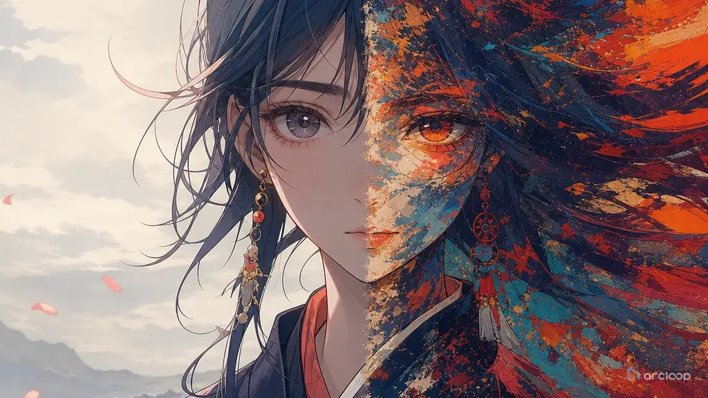
Why style mixing needs a boss
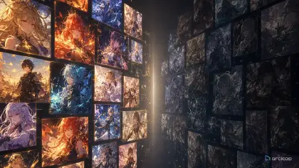
The prompt sounded tasteful: "anime noir mixed with watercolor fantasy and graphic novel energy." The result looked like a menu of effects fighting for the same pixels. Faces were shaded like posters, backgrounds melted like paint, colors turned muddy, and the camera had no genre. Nothing was wrong with any single ingredient. The failure came from giving every style the same authority.
Style mixing works when each visual language gets a job. One style can control shape. Another can control texture. A third can control color or lighting. If every style tries to control every layer, the image averages into generic noise. The viewer cannot tell whether the scene is supposed to feel sharp, soft, old, modern, comic, painterly, cute, or severe.
This guide shows how to mix styles for original AI art direction without creating prompt conflict. The examples use anime scenes, but the principle applies to thumbnails, short videos, character designs, title cards, and Visual references in My Assets. Write the hierarchy rule once as a Visual reference in My Assets, then reuse it across every shot in the project instead of retyping it into each prompt. For ready visual recipes, start with Style Templates, and for theory use Style Formula.
How to assign jobs to each style
Give one style the dominant job. The dominant style should decide the silhouette, line behavior, shot composition, and level of simplification. In anime production, this might be clean cel-shaded character design. Secondary styles should decorate or support, not compete for the character's structure.
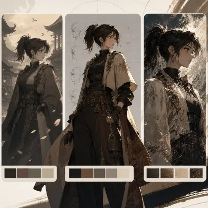
Assign layers plainly. Shape, line, color, texture, lighting, camera, and background depth are separate decisions. "Anime controls character shape, risograph controls color separation, ink-wash controls background texture" is clearer than "anime risograph ink-wash style."
Avoid mixing styles with opposite motion logic in the same short clip. A sharp action style wants clear key poses and impact frames. A dreamy painterly style wants slow transitions and soft edges. You can combine them, but one must lead the timing. Otherwise the clip becomes both blurry and frantic.
Use fewer ingredients than your taste reference contains. Mood boards often include ten inspirations because exploration is messy. A production prompt should use two or three style roles. The rest can remain references for the human team, not instructions for generation.
Review the hierarchy, not only beauty. Ask whether the output followed the assigned jobs. If the secondary texture changed the character's face shape, the hierarchy failed. If the color accent swallowed the lighting plan, the hierarchy failed.
Building the mix: from story need to test
Start with the story function. Write what the scene needs to do before choosing visuals: introduce a desert courier, sell the isolation of a moon colony, make a kitchen duel funny, or show that a shrine map is dangerous. Style mixing should solve that job, not show off the reference set.
Pick the dominant style. For anime scenes, this is often the character and animation language: clean 2D line art, readable silhouettes, cel shading, limited motion, or high-energy key poses. Name it as the layer that outranks the rest.
Add one secondary style for material. This could be paper grain, screenprint offset, ink wash, colored pencil texture, clay-like background modeling, or old poster ink. Keep it away from identity-critical details unless the whole project is designed around that treatment.
Add one accent for color or lighting. Use a small rule: two-color nighttime palette, warm rim light, neon sign reflections, flat festival poster colors, or monochrome background with one saturated prop. Accent rules are strongest when they are narrow.
Write a style hierarchy note. Example: "Character shape and facial identity use clean 2D anime. Background texture uses dry ink wash. Color uses two-tone teal and marigold poster separation. If these conflict, preserve anime identity first, then composition, then texture."
Test with the same scene at different strengths. Generate a clean base, a moderate mix, and a heavy mix. The best production choice is usually moderate. Heavy mixes are useful for covers and title cards, but recurring scenes need more stability.
Store the hierarchy once in My Assets, reuse it everywhere
The style hierarchy doesn't have to become a paragraph pasted into every prompt — write it once as a Visual reference asset in ArcLoop Worlds, inside My Assets. Then it sits beside the character asset and the shot description, and each one only has to carry its own job: identity in the character asset, action and hierarchy words in the shot description.
Use the style note to prevent internal conflict. It can say "clean anime controls characters, ink wash controls distant buildings, poster color controls lighting accents." Then the shot prompt only needs to describe the action and link the rule. This keeps prompts shorter and makes failed takes easier to diagnose.
For exploration, use French BD comic style guide or another style template as a starting point, but translate it into your own hierarchy before applying it to a character. Compare a few generated takes on Canvas and check three things: does the scene still read as your world, did each visual layer do its assigned job, and will the mixed style survive another shot without rewriting the whole prompt.
Here is how to put the hierarchy to work inside a project without rewriting it for every shot.
Open your IP Project and go to My Assets. Create a new Visual reference — name it something like "Style Hierarchy: [your project name]." Write the three-line rule in its description field: which style owns characters, which owns backgrounds, which owns color. Save it.
Upload any reference images that anchor the look — a key frame, a color palette swatch, a texture sample — to Library, then Bind each one to this Visual reference asset as a Reference image. Now the rule has visual evidence attached, not just words.
When you open an Episode and click Generate Shots, the shot cards appear with empty description fields. In each card, type @ and select your character asset first, then add only what changes in this specific shot: the action, the camera position, the lighting beat. You do not need to restate the style rule in every card — reference the Visual reference asset with @ instead, and the hierarchy travels with it.
If a take comes back wrong, open Canvas and compare the failing shot against a clean one. Check one layer at a time: did the character asset hold identity, did the style words in the shot description drift, or did the Visual reference need a stronger constraint phrase? Fix only the layer that broke, then regenerate that single shot rather than the whole episode.
Example 1: Desert Courier With Screenprint Color
Wide side tracking shot. @Rika Vale walks along a desert ridge and raises one hand to shield her eyes from the solar relay flash. Her white sleeveless travel coat and orange message tube remain fully visible against the sand. Dominant style: clean 2D anime controls her face, silhouette, and cel shading. Secondary texture: subtle screenprint grain on sky, sand surface, and tower only — not over her face or coat. Color accent: burnt orange shadows and pale cyan highlights, two-color palette. Camera holds a slow lateral move as she crests the ridge. Keep goggles on her forehead, side knot, and message tube strap consistent through the full shot.
This prompt separates shape, texture, and color. The style mix supports the courier scene instead of competing with it.
Example 2: Kitchen Duel With Comic Panels
Medium front shot, locked camera. @Nomi stands at her station in the school kitchen, two pots steaming behind her, cutting boards lined up neatly. She flips one bundle of noodles with a controlled flick, freezes the instant her collar timer rings, then pushes her round glasses up with one flour-covered finger. Dominant style: expressive 2D anime controls her face, hands, and timing. Secondary style: European comic-style line hatching on cabinets, tiles, and steam shadows only — not on her face. Color accent: flat yellow impact burst behind the timer at the ring moment. Preserve her blunt green bangs, navy apron, and collar timer throughout.
The comic influence has a narrow job: background hatching and one impact accent. The acting remains anime.
Example 3: Moon Colony Ink-Wash Background
Slow push-in from medium-wide to medium shot. @Eno stands in the moon colony greenhouse corridor, rows of small citrus trees under curved glass behind her, Earth glowing softly through the window. She reaches out and touches one leaf, watches a drop of condensation drift upward, then lets out a tired, relieved smile. Dominant style: calm 2D anime controls her face, freckles, and subtle motion. Secondary texture: black ink-wash gradients shape the distant lunar mountains and window glass reflections only — not her face or hands. Lighting: soft bioluminescent green from the plant beds, cool blue rim light on her transparent visor. Keep braids, visor, and jumpsuit stable through the full push.
This example lets ink wash handle distance and mood while anime design protects the character.
Ways style mixing falls apart
The biggest mistake is using style names as a pile. A prompt that says "anime, watercolor, comic, retro, cinematic, painterly" does not explain who controls what. Translate names into jobs.
Another mistake is giving secondary texture access to the face. Texture over facial identity can change age, expression, and recognizability. Keep strong texture on backgrounds, clothing shadows, props, or title cards unless facial treatment is the whole experiment.
Creators also mix color systems that cancel each other. Pastel softness, noir contrast, neon saturation, and sepia warmth cannot all dominate. Pick one color rule and let other references step back.
A fourth mistake is approving a style mix that only works as a still image. Video adds timing, motion blur, camera behavior, and continuity. Test the mix on a short action before using it across episodes.
Finally, do not treat a mood board as a prompt. A mood board is exploration. A style hierarchy is production. The hierarchy should be short enough for another creator to apply without interpretation.
FAQ
How many styles can I mix in one AI art prompt?
Two is usually enough for production. Three can work if each has a separate layer, such as anime for character shape, screenprint for texture, and a limited palette for color. More than that usually belongs in exploration, not final prompts.
What should the dominant style control?
It should control the things viewers recognize first: character shape, composition, motion language, and clarity. For anime scenes, the dominant style usually protects face design, body proportions, outfit silhouette, and key poses.
Can I mix a painterly background with anime characters?
Yes. Keep the hierarchy explicit: anime controls characters and motion, painterly treatment controls background surfaces and atmospheric light. Test close-ups to make sure the background treatment does not bleed into identity.
How do I make style mixing easier to manage?
Store the hierarchy once as a Visual reference asset in My Assets, then reuse it in every shot description instead of retyping it. When a take doesn't land, check it layer by layer on Canvas — character asset, style words, shot description — and fix only the layer that failed instead of rewriting the whole prompt.
When should I stop mixing and choose one style?
When the mixed result no longer improves the story function. If the viewer notices the collision of styles before they understand the character, action, or mood, simplify to one dominant visual language and one small accent.