Introduction
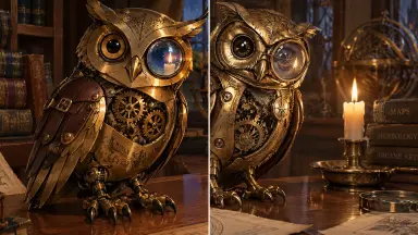
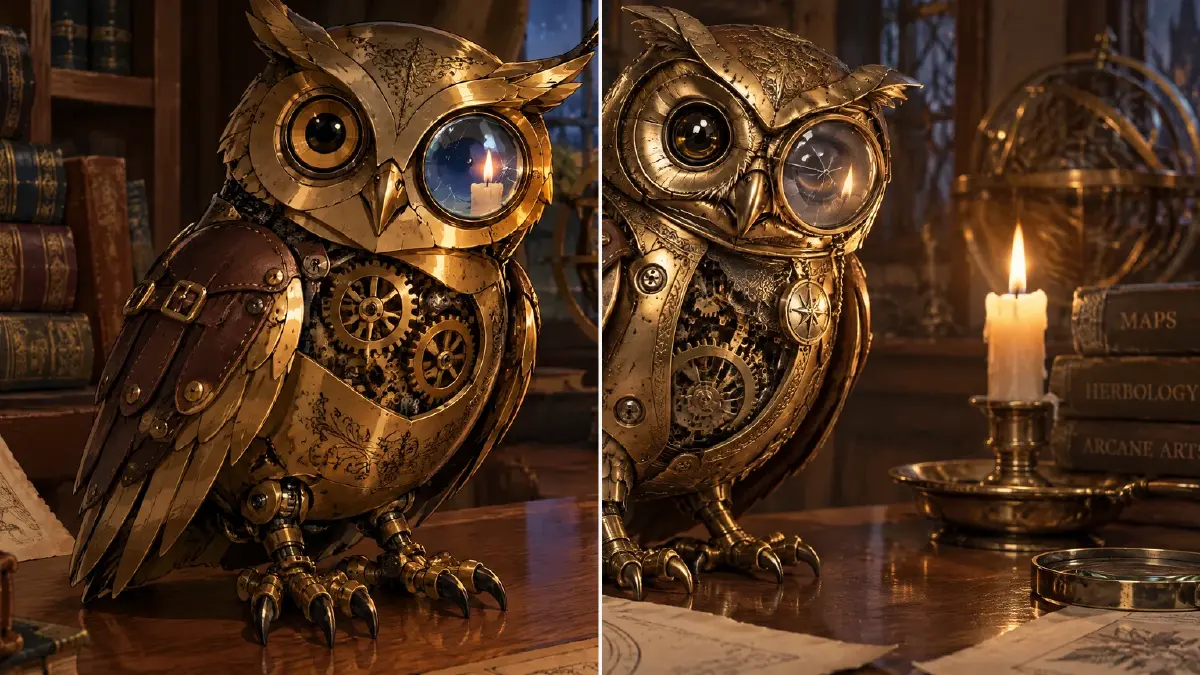
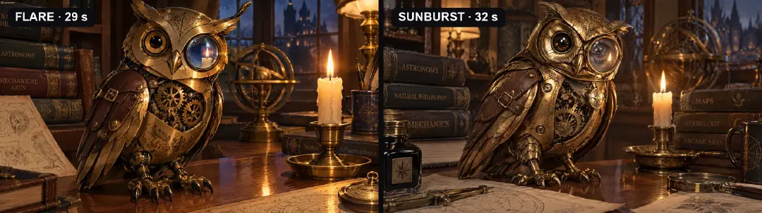
Give GPT Image 2.5 Flare and Sunburst the same prompt for a brass mechanical owl and you get two different objects. Flare draws an owl: clean outlines, cel-shaded brass, gears that read as a picture of gears. Sunburst builds one: worn metal with patina, rivets you could count, a mechanism sitting behind a real surface. At thumbnail size they look like siblings. At 100% they look like they came from different studios.
That gap is the whole question behind "Flare or Sunburst?" — and "Sunburst is better" is only half an answer. We ran four identical prompts through both tiers, one generation each, no rerolls, and timed them. Sunburst won every close-up on materials. Flare followed the prompt more literally, kept the anime look, and finished the two text-heavy prompts in half the time. Here are the side-by-sides, and how to choose the tier for each frame in ArcLoop.
The test: four prompts, one run each
Same prompt, same aspect ratio, 2K, default quality, one generation per tier, nothing edited. The four prompts were picked to stress what each tier is supposed to be good at: an anime close-up (skin, wet hair, embroidery), a short-drama poster with Chinese and English text, a mechanical prop (metal, gears, glass), and an acrylic merch set with a small printed label.
| Prompt | What it stresses | Flare | Sunburst |
|---|---|---|---|
| Rain close-up | skin, wet hair, gold embroidery | 28 s | 32 s |
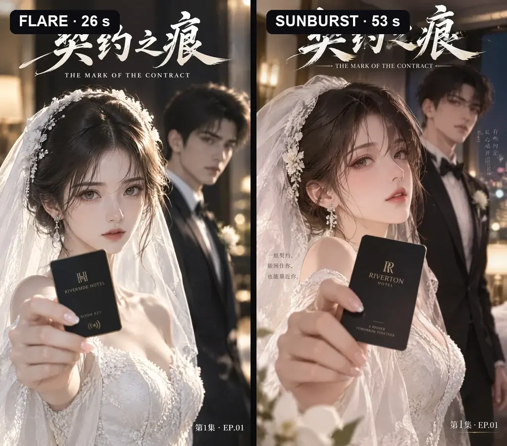
| Short-drama poster | Chinese + English title, layout | 26 s | 53 s |
| Mechanical owl | brass, gears, cracked glass | 29 s | 32 s |
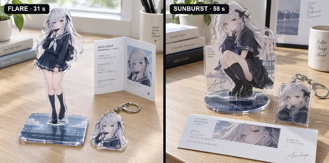
| Acrylic merch set | acrylic edges, small label text | 31 s | 58 s |
The times are the model's generation time for one 2K image in our run. In the app you also wait in the queue, so read them as a ratio: on pure images Sunburst was about 10% slower; on the two prompts with text and layout it took about twice as long.
Where the gap is obvious: materials
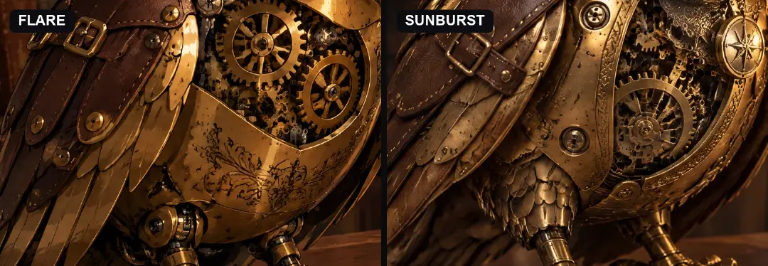
The owl is the clearest case. Flare's brass is painted — flat highlights, outlined engraving. Sunburst's brass has wear, patina, raised borders, and depth behind the gears.
The same thing happens on fabric. The close-up asked for gold cranes embroidered on a rain-soaked collar. Flare prints them on the cloth; Sunburst stitches them — raised feathers, wet thread, water beading along the seam.
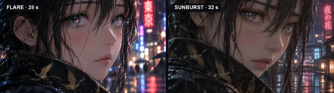
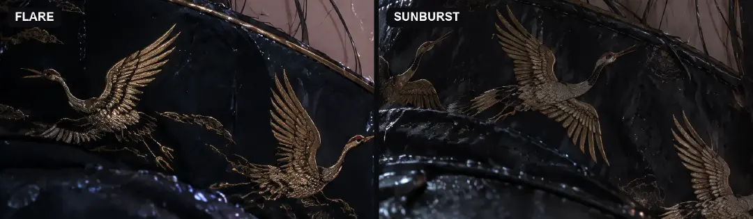
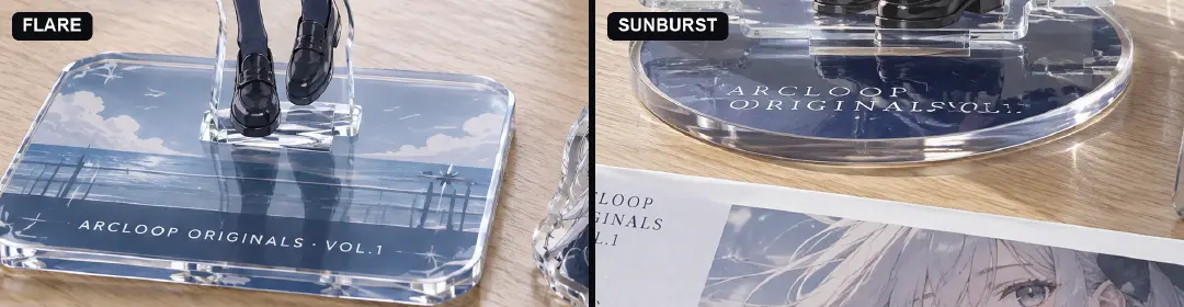
And on product: Sunburst's acrylic base has thickness, a bevel that catches light, and a refraction line where it meets the desk. Flare's is a clean, flat plate. If a frame will be looked at closely — a cover, a merch mockup, a close-up that holds for five seconds — this is what the extra wait buys.
Where Sunburst designs and Flare obeys
The poster prompt asked for three pieces of text: 契约之痕, THE MARK OF THE CONTRACT, and 第1集 · EP.01. Both tiers got all three right, brush calligraphy included. But Sunburst did more than it was asked: it framed the subtitle with rules, added gold flecks to the brushwork, and wrote two lines of Chinese tagline into the empty space. It looks like a finished poster. It also contains copy nobody approved.
The merch prompt asked for one label on the base: ARCLOOP ORIGINALS · VOL.1. Flare printed it exactly on a flat rectangular base. Sunburst chose a round base, ran the label along the curve — and broke it: the separator and "VOL.1" came out garbled. Its insert card got the same label right.
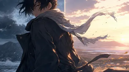
Even in the close-up, the prompt asked for neon signs "reflected as tiny colored catchlights." Flare put red and blue signs in both irises. Sunburst rendered beautifully realistic eyes — with mostly white catchlights.
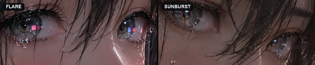
The pattern across all four: Sunburst reads the prompt as a brief and designs around it. Flare reads it as a spec.
The style drift nobody mentions
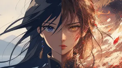
Every prompt said "anime," and every Flare result came back more anime. Sunburst pulls toward rendered realism — pores, patina, photographic depth of field. For a key visual or a merch mockup that is often exactly right. For a series with a cel-shaded look, one Sunburst shot dropped between Flare shots will look like it belongs to a different show.
The rule that follows: keep one tier for frames that cut together, and switch only for frames that stand alone. The GPT Image 2.5 explainer covers what else changed from Image 2; the draft-and-promote logic is the same one the Seedream 5.0 Lite vs Pro guide uses.
How to choose the tier in ArcLoop, step by step
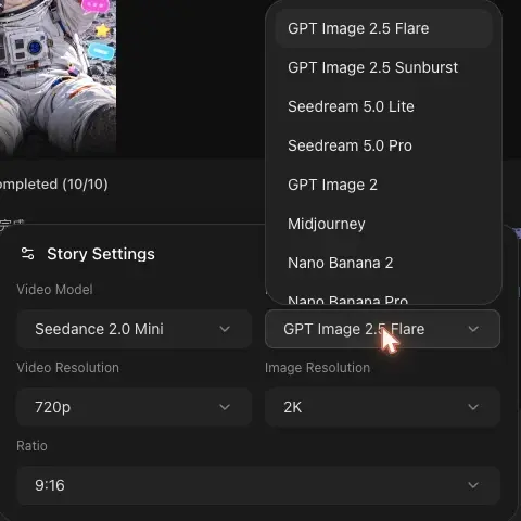
- Open Story Settings from the model chips under the chat box. The Image Model list has both GPT Image 2.5 Flare and GPT Image 2.5 Sunburst.
- Block on Flare. Casting tests, shot stills for the episode, composition checks. It follows the prompt closely and returns fastest.
- Keep frames that cut together on one tier. The shots of an episode stay on the tier you started with, so the look does not jump at the cut.
- Switch to Sunburst for frames that stand alone: covers, key visuals, merch mockups, material close-ups.
- Keep the same prompt and references. Both tiers take the same input; only the model changes. Reference characters with
@so identity comes from the asset, not the tier. - Lock the text on Sunburst. List the exact strings, add "no other text," and proofread every letter at 100% before you ship. The cover design guide covers title placement.
- Bind the approved frame to the asset or project and note which tier made it, so a re-generation months later matches.
Example 1: Flare for the series still
@Mina Park stands at her desk in @Classroom 2-B, morning light from the left window, looking down at the glowing contract mark on her wrist. Medium shot, camera at eye level, static. Clean cel-shaded anime look matching the series style reference: flat shading, crisp outlines, soft shadows. No text anywhere in frame. Image model: GPT Image 2.5 Flare, 2K, 9:16. Same settings as the other shots of this episode.
Example 2: Sunburst for the merch close-up
Product close-up of a clear acrylic standee of @Mina Park on a light oak desk, soft window light from the left. Thick acrylic with a polished bevel catching the light and visible edge refraction; printed base. Base label, exactly and only: THE GUARDIAN AT DESK THREE. No other text anywhere. Character art taken from the asset's Main image, unchanged. Image model: GPT Image 2.5 Sunburst, 2K, 1:1.
Example 3: Sunburst for the cover, with the text locked
Vertical short-drama cover, 9:16. @Mina Park in the foreground holding up her wrist, the contract mark glowing; @Jae Han behind her, out of focus, in the classroom doorway. Exact text, only these three strings: top title 守护者之印 in brush calligraphy; under it THE GUARDIAN AT DESK THREE; bottom-right EP.01. No taglines, no extra copy. Image model: GPT Image 2.5 Sunburst, 2K.
The most common ways the tier choice goes wrong
- Sunburst for every draft. Up to twice the wait on layouts, for frames you will throw away.
- Mixing tiers inside one scene. The look jumps at the cut. One tier per sequence.
- Trusting Sunburst's extra copy. It writes taglines you did not approve. Say "no other text."
- Assuming Sunburst spells better. In our test it broke a label that Flare got right. Proofread at 100%.
- Blaming the tier for a face change. Identity comes from
@assets. If the face changes between tiers, the reference is weak, not the model.
FAQ
Is Sunburst just a higher-quality Flare? Not quite. It renders materials and layout better; it also embellishes and pulls toward realism. Whether that is "better" depends on whether the frame stands alone.
Which one is faster? Flare. In our run the gap was small on pure images, about 10%, and about 2× on prompts with text and layout.
Do I need to rewrite prompts to switch tiers? No. Both tiers take the same input. Switch the Image Model in Story Settings and keep the prompt and references.
Which tier for a short-drama cover? Sunburst, with the exact text listed and "no other text" added — then proofread it at full size.
Next step
Open Story Settings in ArcLoop, leave the image model on Flare, and block your next episode. Pick the one frame that will be judged up close — the cover or the merch mockup — switch that single generation to Sunburst with the same prompt, and put the two side by side at 100%. The gap will be obvious. Now you will know which side of it the frame needs.