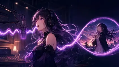


When a lighting school falls apart
You approve a beautiful first shot: a young astronomer opens the brass shutters of an observatory, blue morning leaking through the dome while one amber desk lamp catches her face. Then the next shot moves to the archive downstairs and the whole film changes personality. The shadows become hard black, the sky turns candy pink, the character's eyes look different, and the "same world" now feels like a folder of unrelated test renders.
That failure is not fixed by adding more color adjectives. Lighting and color schools need production rules, not mood words. A school can be theatrical chiaroscuro, pastel morning haze, fluorescent urban night, limited cel palette, warm watercolor wash, or high-contrast poster lighting, but the useful question is simpler: what light behavior and color relationship should survive from shot to shot?
ArcLoop is useful here because the lighting decision can live right beside the character asset and the shot card, instead of floating in a separate note. You can build the character in character profile fields, choose a look from Style Templates, and keep the world logic in Creative Worlds before generating a shot card.
This guide shows how to turn lighting and color traditions into prompt language that a reviewer can actually check. The goal is not to imitate a named artist or chase a vague "cinematic" look. The goal is to make a lighting-color school visible enough that three different shots still belong to the same anime short.
What makes a lighting school hold together
Choose the lighting school by physics and story pressure, not by vibes. "Dreamy blue" is vague; "cool skylight fills the room, warm practical lamps touch only faces and brass props" gives the model a rule.
Keep the character's readable colors separate from the environment palette. If Nella's teal scarf and copper hair clip are identity anchors, the background can shift from dawn to night without stealing those hues. Treat character colors like continuity props. They can be lit differently, but they should not be replaced.
Name the shadow behavior. Soft watercolor shade, crisp cel shadow, rim-lit silhouette, low-key theatrical shadow, flat poster shadow, and bounced interior shadow all lead to different images.
Define color relationships instead of listing swatches. Complementary tension, analogous calm, split warm-cool separation, limited two-ink palette, or muted earth palette with one signal color gives a stronger instruction than ten color names. The model needs hierarchy: dominant color, supporting color, accent color, and forbidden drift.
Plan for scene variety. If the rule cannot survive a close-up, wide shot, indoor scene, and action beat, keep it as a shot note rather than the project's Visual reference.
Review small before polishing large. Generate a three-shot shot card: face close-up, wide environment, and action beat. If the school survives those three, it is ready for polish.
How to build a lighting school: from anchor to shot
Start with a failure sentence. Write what broke in plain terms: "the observatory short becomes a different palette in every room" or "night scenes make the lead unrecognizable." This line gives reviewers a shared reject rule.
List fixed visual anchors. For a character-led anime short, include face shape, hair color, outfit silhouette, signature accessory, skin-tone handling, and one or two palette anchors. For a world-led piece, include sky treatment, shadow softness, material response, and accent-color usage. Keep the list short enough to check while looking at thumbnails.
Write the lighting source rule. Identify the main source and the allowed secondary source. Example: "cool window light from frame left, warm brass practicals only on hands and instruments." If a later shot has no window, transhot card the same relationship into another source: moonlight and lantern, monitor glow and streetlight, stage spot and backlight.
Write the color script rule. Decide whether color changes by emotion, time of day, location, or story act. Do not let every change happen at once.
Build this out using Visual references in My Assets. Bind one reference image to control palette, another to control shadow edge, another to control environment material — the same way a character asset can hold multiple reference images for different looks. Do not let a background reference rewrite the character. The discipline is simple: every reference gets one job.
Turn the lighting reference set into shot prompts. For each shot, describe subject, action, camera, light source, color relationship, and constraints. If you need a starting point, open Lighting Specification Character Asset or compare with Style Formula.
Generate a small batch of variants. Pick one close-up, one medium action, and one wide establishing shot. If the face reads, the action reads, and the palette still belongs to the same world, move to polish.
How ArcLoop binds light rules to the right objects
ArcLoop keeps the lighting-color school attached to the production objects that actually need it: identity colors live in the character asset, recurring environment light lives in a scene asset, emotional beats live in the Story Outline, and camera and timing live in the shot card.
Write the color plan into the Story Outline before final generation — where the story gets warmer, where contrast increases, where a signal color appears, and where the palette should stay quiet. When a shot fails, you can tell whether the problem sits in the scene asset, the character asset, the shot's camera, or just the wording of the shot description.
The review order matters. First check whether the approved light direction is present. Then check character identity. Then check action readability. Only after those pass should you improve glow, grain, lens behavior, or fine color grading. Polish is not a rescue plan for a shot lit by the wrong rule.
The useful artifact is a one-page shot cards: fixed sources, flexible sources, shadow behavior, palette hierarchy, and rejects. If a rule needs three paragraphs to explain, it is not ready for production.
Putting the lighting school into practice inside ArcLoop
Start in My Assets. Create one Visual reference for your palette control and bind the image you want the generator to treat as the dominant color anchor — this is its Main image. Add a second Visual reference for shadow edge behavior and bind a separate image as its Main image. These are not decoration; they are the production rule the generator reads when you use them in a shot.
Open your Episode and click Generate Shots. Once the shot cards appear, find any shot that moves to a new environment — the archive, the rooftop, the corridor. In the shot description, type @ and add both Visual references alongside the character asset. Write only what is new about this shot: the light source available in this location, the one action, and the camera position. Do not re-describe @Nella's appearance; that lives in the character asset.
Generate the image first. Check that the palette hierarchy and shadow edge match your Visual references before you spend credits on video. If the face reads and the teal scarf is visible, click generate video. For a run of consecutive shots, open the AI Chat Panel and type: "Generate videos for Shots 3, 4, and 5." In Edit, arrange the clips on the timeline and replace any single shot that drifted without rebuilding the sequence.
Example 1: Copper Dawn Observatory
Open the Copper Dome IP Project in ArcLoop. In My Assets, create a Visual reference named "Copper Dawn Palette" and bind a reference image controlling dominant shot card-blue and muted violet tones. Add a second Visual reference named "Shadow Edge" and bind an image showing soft cel shadow behavior. In Story Brief, set style to Anime and aspect ratio to 16:9. In the Story Outline, note the color script: interiors shift from cool ambient to warm amber when Nella makes a decision. Every shot that uses @Nella should carry the constraint: copper highlights limited to instruments and the astrolabe pin; no candy-pink sky; no random neon.
This prompt creates a reviewable school instead of a decorative color note. The world can move from dome to archive without losing its lighting logic.
Example 2: Nella opens the shutters
Medium three-quarter shot of @Nella inside the hilltop observatory, slightly below shoulder height. She grips the brass shutter wheel on frame right and turns it slowly; a blade of cool blue dawn light crosses the telescope floor. One warm amber desk lamp behind her adds a thin rim on her hair and hands. Soft cel shadow edges. Copper highlights only on the wheel, telescope body, and her astrolabe pin. Scarf tip lifts as air moves; dust crosses the light beam; the pin catches one flash of amber. Keep face, teal scarf, and hands on the wheel readable throughout.
The shot has one action and one lighting change. That gives the model a concrete way to show the school instead of only describing it.
Example 3: Fixing archive color drift
Revise the archive shot: @Nella walks left to right between tall star-chart shelves. Identity and framing are approved; fix only the color layer. Replace the green cast with cool shot card-blue ambient from a high round window above frame. Add small amber lamp pools at table edges. Soft readable shadows throughout. Copper accents only on instrument corners and @Nella's astrolabe pin. Reject any version where the palette turns candy-bright, the teal scarf shifts hue, the shelves collapse to black silhouettes, or warm light floods the entire frame.
The revision does not rebuild the scene. It fixes the one layer that drifted, which is usually the fastest path to a usable sequence.
Ways lighting schools break
The first mistake is using school names as if they were production rules. "Noir," "pastel," "retro," or "cinematic" can be useful shorthand in a conversation, but a prompt still needs source direction, contrast, palette hierarchy, and shadow behavior.
Another mistake is letting the environment recolor the character. A night market can be saturated without turning the lead's hair, eyes, and outfit into new assets.
Creators also confuse color richness with color variety. A coherent school may use only three main colors and still feel deep because the values, shadows, and accents are controlled. Random extra colors usually make the shot less memorable.
A fourth mistake is changing lighting, camera, outfit, and action in the same revision. Change the weakest layer first so the result teaches you something.
Finally, do not ask for a living artist, studio, or protected franchise look. Use descriptive craft language: light direction, shadow edge, cel finish, watercolor wash, palette relationship, exposure level, and compositing softness.
FAQ
How specific should a lighting and color school prompt be?
Specific enough that a reviewer can reject a wrong shot without arguing. Name the light source, shadow edge, palette hierarchy, and character color anchors. Leave small flexible choices for location and emotional beat.
How do I keep night scenes from crushing character detail?
Write a face-readability rule. For example: "night scenes use cool ambient fill, but eyes and mouth stay readable, and identity colors remain visible at thumbnail size." In ArcLoop, add that rule directly into each night shot's description on its shot card.
Can I keep my color plan and shot prompts in the same place?
Yes. ArcLoop keeps character and scene assets, the Story Outline, shot descriptions, and generated takes inside the same project, so a color rule written into the outline or a shot card stays attached to the shots it controls instead of drifting off into a separate document.