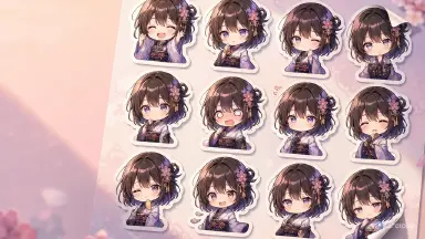
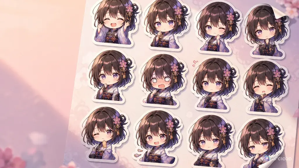
Why Cute at Full Size Fails in a Chat Bubble
Anime stickers are tiny acting shots. They have to read in a chat bubble, on a phone screen, inside a comment reply, or as a quick reaction in a creator community. The usual failure is obvious: the character looks cute at full size, but the expression disappears once the image is small. The outline is too thin, the prop covers the mouth, the background fights the silhouette, or the set includes eight emotions when one would have been stronger. This guide shows you how to write anime sticker prompts that stay readable at chat-bubble size, step by step.
A good anime sticker prompt is not a full illustration prompt. It is an expression design brief. It names the character, the exact reaction, the readable pose, the crop, the outline, the small prop if needed, and the transparent-ready background. The sticker should be reusable without explaining the lore behind it.
This guide shows how to create anime stickers from your own original characters while keeping faces consistent across a set. It covers principles, prompt structure, ArcLoop workflow, three complete examples, common mistakes, and FAQ answers. If the character is not locked yet, start with OC Expression Consistency Sheet or browse character profile fields.
Rules for Readable Sticker Expressions
The first principle is one sticker, one emotion. "Annoyed but secretly happy" can work if the face is simple, but "angry, crying, excited, embarrassed, sarcastic" will usually collapse. Pick the reaction someone would actually send.
The second principle is silhouette at chat size. Big hair shapes, chunky sleeves, raised hands, and clear props help. Thin jewelry, tiny buttons, complex lace, and background details do not.
The third principle is clean outline. Stickers need separation from whatever chat background they land on. Ask for a bold outer stroke, simple interior lines, and a transparent-ready or plain background.
The fourth principle is face consistency across the set. The same OC should keep eye shape, hair silhouette, face proportions, and accessory placement. Change the expression, not the identity.
The fifth principle is short pose language. A sticker can shrug, pout, cheer, salute, hide behind a notebook, hold up a snack, or lean into frame. It should not perform a full action sequence.
The sixth principle is no fake text unless you are adding it yourself later. Generated words on stickers are often broken. If you need a text sticker, leave space for typography rather than asking the image prompt to draw letters.
How to Build a Sticker Prompt: From Reaction to Constraints
Start with the sticker purpose. Write the reaction first: "deadline panic," "quiet yes," "do not touch my snacks," "battle ready," "I saw that," or "tiny celebration." The emotion should be useful in a real message.
Anchor the character. Use the approved OC sheet or name a compact identity: hair, eyes, outfit cue, and one accessory. Do not redesign the character for every sticker.
Choose the pose. Keep it readable: close-up head-and-hands, waist-up chibi, bust crop, or small full-body pose. If hands matter, keep them away from the face unless covering the mouth is the joke.
Define the face. Mention eyebrow shape, mouth shape, eye focus, blush, sweat drop, sparkle, or deadpan stare only if each piece supports the one reaction.
Add a small prop only when it improves the reaction. A bent spoon, burnt toast, tiny flag, cracked teacup, or folded fan can help. A cluttered table will not.
Set the sticker finish. Use clean 2D anime, bold outline, transparent-ready background, simple shadow, limited palette, and enough margin around the character.
End with constraints: no text, no logo, no cropped face, no extra fingers, no inconsistent eyes, no background clutter, no realistic rendering, no changed outfit.
Making a Sticker Set Inside ArcLoop
ArcLoop's useful shortcut is to treat a sticker set as one character asset with many reference images, not separate one-off images. Build or load the character in ArcLoop Worlds, bind a reference image for each expression, then generate each sticker from the same @ reference.
Use OC Expression Consistency Sheet when you need multiple reactions from the same OC. That gives you a stable face before you split the set into transparent-ready sticker outputs.
Review stickers at actual size. A full canvas can hide bad sticker design because small line breaks and muddy expression still look detailed when enlarged. Check thumbnail readability, outline thickness, prop clarity, and whether the expression still reads without captions.
For a set, define a small reaction list before generation. Four to eight stickers is enough for a first pass: greeting, yes, no, panic, celebration, suspicion, sleepy, and thanks. Do not create twenty reactions before you know the face stays consistent.
When a sticker is close but not usable, revise the smallest visible layer. If the face reads but the prop is muddy, simplify the prop. If the pose is funny but the OC no longer matches the sheet, restore the hair, eye shape, and outfit cue before changing the joke. If the outline disappears on a dark background, thicken the outer stroke instead of adding a busier backdrop. Sticker prompts improve fastest when every retry answers one practical chat-size problem.
Treat the sticker set as one character asset, not a folder of unrelated images. Open the character in My Assets and bind a new reference image each time you lock a new expression — panic, celebration, suspicion — onto that same asset instead of creating a new character for every mood. Open the Episode, add a shot card for each sticker, and use Generate Shots if you want a rough first pass to edit from.
Write only what's new for that sticker inside each shot card — the reaction, the pose, the small prop — and pull the character in with @Tika instead of retyping hair, eyes, and outfit every time. Generate the image and check it at actual chat size before you touch video at all; a sticker set only needs the still frame from that first pass. If one sticker's face drifts off-model, don't start over — reopen the character asset, confirm the right reference image is bound, and regenerate just that one shot card.
Example 1: Deadline Panic Sticker
Generate a transparent-ready anime sticker of @Tika. Reaction: deadline panic, one clear action. Crop: waist-up chibi. She clutches a stack of loose index cards against her chest while one card flips upward — wide worried eyes, small open mouth, one sweat drop, raised eyebrows. Finish: clean 2D anime, thick white outer outline, simple interior lines, soft flat color, enough margin around her, background transparent-ready with no room detail. Everything else about Tika — glasses, hair clips, cardigan, ink smudge — comes from her character asset, not this prompt. No text, no logo, no extra fingers, no changed outfit.
This sticker works because every element serves panic: cards, eyes, sweat drop, and hunched pose. It does not need a full archive background.
Example 2: Tiny Victory Sticker
Generate a transparent-ready anime sticker of @Oren. Reaction: tiny victory after fixing a problem. Crop: bust. He raises one small fist near his cheek while holding a single noodle strand with chopsticks in the other hand — closed-eye grin, lifted cheeks, one small sparkle near the fist, no open-mouth shouting. Finish: bold anime sticker outline, warm colors, simple shadow under the chin, clean transparent-ready background. Headband, apron, and ladle pin stay exactly as set on his character asset — only the fist, the noodle, and the grin are new here. No text, no logo, no extra hands, no food brand labels.
The prop is small and specific. It supports the reaction instead of becoming a food illustration.
Example 3: Suspicious Plant Sticker
Generate a transparent-ready anime sticker of @Miri. Reaction: suspicious stare at something off-screen. Crop: head-and-hands. She leans slightly forward, holding a tiny potted cactus beside her face; give the cactus two simple dot eyes so it looks equally suspicious, but keep Miri as the primary focus. Face: narrowed eyes, flat mouth, one eyebrow angled down, calm deadpan comedy. Finish: clean anime sticker, thick outer stroke, transparent-ready background, limited green-yellow-blue palette, readable at small size. Braid, brooch, and gloves stay as set on her character asset. No text, no logo, no crowded background, no extra fingers, no photorealism.
This example uses a prop character, but the prompt still says who is primary. That keeps the sticker from turning into a plant mascot sheet.
The Most Common Sticker Prompt Failures
The first mistake is treating a sticker like a poster. Big backgrounds, full outfits, dramatic lighting, and tiny props will vanish in a chat bubble.
The second mistake is making the expression too complicated. Stickers are used fast. If the viewer needs a paragraph to understand the reaction, the design is not doing its job.
The third mistake is changing the face across the pack. If one sticker has round eyes, another has sharp eyes, and a third changes hair length, the set stops feeling like the same OC.
The fourth mistake is adding generated text. Broken letters make otherwise usable stickers look unfinished. Leave clean space if you plan to add words later.
The final mistake is forgetting the outline. A sticker without a strong outer shape can disappear on dark mode, light mode, or patterned chat backgrounds.
FAQ
What makes a good anime sticker prompt?
A good sticker prompt names the OC, one reaction, readable pose, face details, crop, outline, transparent-ready background, and constraints. It should be simpler than a normal illustration prompt.
Should anime stickers use chibi style?
Chibi style helps for comedy and strong reactions, but it is not required. Bust crops and head-and-hands stickers can work if the outline and expression are clear.
How do I keep a sticker pack consistent?
Use the same @ reference to the character asset for every sticker, then change only the reaction, pose, and prop. Keep eye shape, hair silhouette, outfit cue, and accessory placement stable.
Can I add text to anime stickers?
You can, but do it as a separate design step. For the image prompt, ask for no text and leave space. This avoids broken generated lettering.
How do I keep a whole sticker pack from drifting off-model?
Yes. Build the character once as a character asset, bind a reference image for each reaction, then reference that same asset with @ for every sticker. Each sticker varies the emotion without drifting away from the character because the identity always comes from the same asset.