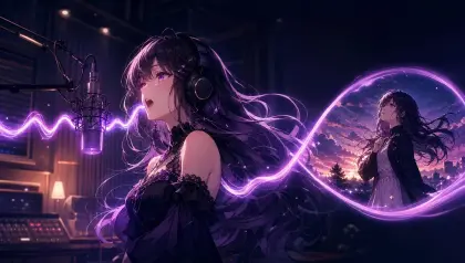
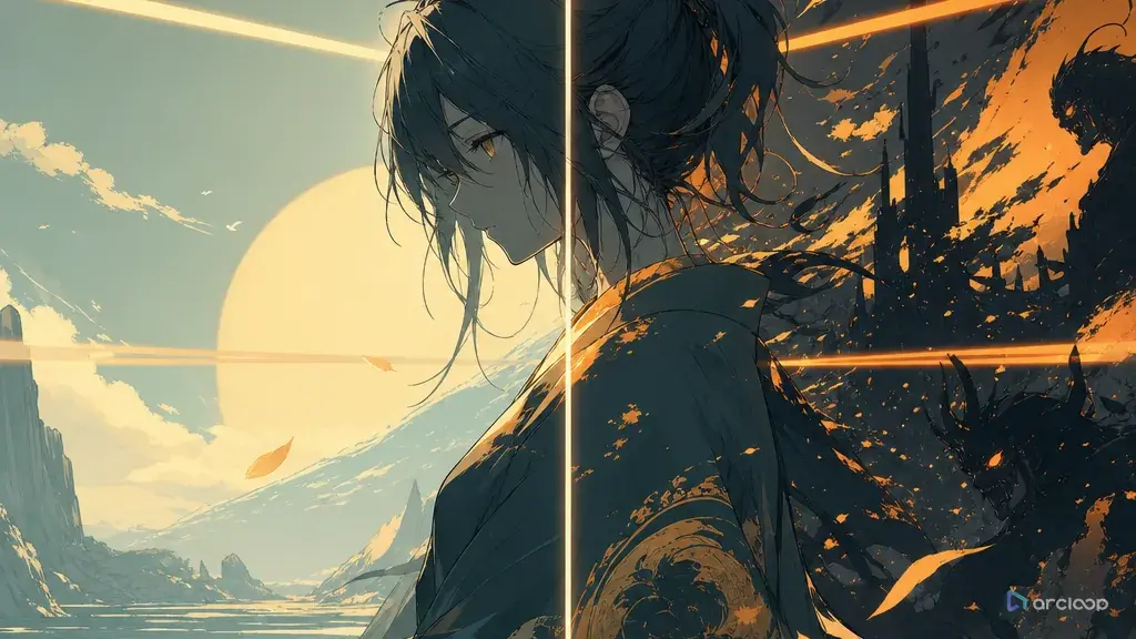
When One Series Looks Like Five Different Shows
Color drift is sneaky because each individual image can look good. The first shot has cool moonlight and a warm brass accent. The second shot pushes everything toward candy pink. The third becomes teal and orange. The fourth goes almost grayscale. Nothing is obviously broken until you place the takes side by side and realize the series no longer has a visual memory.
Palette control is not about making every frame the same color. It is about deciding which colors carry identity, which colors carry mood, and which colors are allowed to shift by scene. A character's red scarf may stay fixed. A town's night windows may always be amber. A flashback may lower saturation. A danger cue may introduce acid green for one beat. Without those rules, every prompt invites the system to invent a new color script.
This guide gives you a practical color palette control method for anime images, AI video shots, character sheets, and short-series production. You will define a base palette, assign accent colors, set a saturation ceiling, protect neutrals, and compare draft takes side by side in Canvas before final polish. For style exploration, start with Style Pack Templates. When the palette is part of a longer project, keep it next to the storyboard inside ArcLoop Worlds.
Color Roles Before Color Taste
Start with color roles, not color taste. "Beautiful blue lighting" is taste. "Indigo shadows for the observatory, warm brass for instruments, pale mint only when the star map activates" is a role system — write it that way in the shot descriptions and the model has an actual rule to repeat, not just a mood to reinterpret each time.
Limit the palette before you add detail. Most short anime clips can survive on a base color, a shadow color, a neutral range, one accent, and one rare signal color. More colors are allowed, but they should be background variation, not competing identity anchors.
Separate character colors from scene colors. If the character's coat is always vermilion, do not let every sunset, warning light, and background sign use the same vermilion. The viewer should know what belongs to the character and what belongs to the environment.
Set a saturation ceiling. AI outputs often chase vividness when the prompt says cinematic, magical, neon, dreamy, or dramatic. A ceiling such as "mostly muted, only the compass glow reaches high saturation" keeps the palette from becoming a poster wall.
Use neutrals deliberately. Cream paper, warm gray stone, blue-black shadows, brown leather, and off-white clouds give bright colors room to work. If everything is saturated, no accent has authority.
Review in groups. A palette can look fine in isolation and fail in sequence. Compare the character sheet, key background, hero shot, close-up, and cover frame together. The method only works if you can see whether the rules repeat.
How to Build a Palette Prompt Step by Step
Write the palette sentence first. It should fit in one line: "Use smoky violet shadows, dusty cream highlights, weathered brass accents, and one bright mint signal color for magic." If the sentence needs three commas and a slash list, it is probably too loose.
Assign the fixed colors. Give the original character two or three repeat colors: hair, jacket, accessory, eyes, or prop. Give the world two repeat colors: sky, stone, window light, signage, fog, water, or interior wood. Keep these stable unless the story reason is explicit.
Choose the flexible colors. Some colors can change by time of day, camera angle, emotional beat, or platform crop. Mark them as flexible so a shot can breathe without breaking continuity.
Define saturation and contrast. Say whether the palette is muted, pastel, crisp, high-contrast, low-contrast, warm-neutral, cool-neutral, dusk-weighted, or ink-heavy. Then name the one area allowed to be bright.
Put palette rules into the shot card. Do not bury color in the last line after motion, character, and camera. Color affects the whole shot, so place the palette near style and lighting, then repeat the fixed anchors in revision prompts.
Draft small. Generate a character sheet, key background, and one story shot before you produce a full sequence. Use City Pop Vaporwave Poster when you want to study a strong palette template, then strip it down to the colors your own project needs.
Review against the palette board. Ask three questions: did the fixed colors survive, did the accent stay rare, and did the scene still read at thumbnail size? If the answer is no, repair palette before adding more background detail.
Put the Palette Board in My Assets, Not a Separate Doc
Palette control becomes useful once it lives beside the real production assets instead of in a separate document. Keep the swatches as visual references in My Assets, next to the character assets, scene assets, and the shots that use them. Don't treat it as a decorative moodboard — write down what each color does: identity, location, emotion, danger, memory, UI-safe space, or final-frame contrast.
This keeps color from turning into a late-stage filter. Because the swatches sit in My Assets next to the character assets, you can pull the same color logic into the Story Outline, the shot descriptions, and the cover frame without redefining it each time. If a later shot needs a new color because the story changes, add it as a named exception in the visual reference rather than letting the whole project drift.
For longer anime shorts, combine palette review with Storyboard Continuity. The storyboard tells you which beat is warm, cold, flat, bright, or desaturated. The palette board tells you how far each beat may move without losing the series identity.
Example 1: Night Observatory Palette Board
Create a 2D anime palette board for an original short called The Brass Star Map. Character: Elian Voss, a young observatory apprentice with ash-brown hair, round bronze goggles, a dark plum coat, cream shirt, and a small mint-glowing astrolabe. Setting: a hilltop observatory with slate roof tiles, dusty brass instruments, blue-black night sky, and warm window light. Palette rule: base colors are smoky violet, blue-black, dusty cream, and aged brass. Accent color is mint light from the astrolabe, used sparingly only on magical reflections and eye highlights. Keep saturation moderate, with no candy neon and no rainbow gradients. Show character colors, setting colors, accent use, shadow range, and one cover-frame thumbnail. No text labels, no logos, no copied symbols, no photorealism.
This prompt creates a usable palette asset. The mint color has a job, so it will not spread randomly across the whole scene.
Example 2: Palette-Controlled Story Shot
Use the approved Brass Star Map palette board and Elian Voss character sheet. Create a 7-second 2D anime shot inside the hilltop observatory after midnight. Camera: medium shot from behind a brass telescope, Elian framed in profile, hands visible as he opens the mint-glowing astrolabe. Action: he studies the star map, notices one impossible constellation, and slowly looks toward the locked roof hatch. Palette: keep smoky violet and blue-black shadows across the room, dusty cream on papers and shirt, aged brass on instruments, and mint only from the astrolabe glow and tiny reflected points on the goggles. Warm window light stays low and amber, not orange. Clean cel shading, soft painted background, no sudden teal-orange shift, no pink sky, no over-saturated magic, no changing coat color, no text.
The shot can have drama without inventing a new color world. Every color has a repeated role from the board.
Example 3: Cover Frame Palette Revision
Revise the selected vertical cover frame for The Brass Star Map. Keep Elian's ash-brown hair, bronze goggles, dark plum coat, cream shirt, and mint astrolabe. Keep the observatory interior with slate shadows, dusty papers, brass instruments, and blue-black night outside the window. The current version is readable, but the mint glow spread across the whole background and made the palette feel generic. Repair only color control. Mint should be the rare signal color, strongest at the astrolabe, softer on Elian's goggles, and absent from unrelated walls. Restore smoky violet shadows and aged brass accents. Keep the final frame mobile-readable with face and astrolabe clear. No new colors, no rainbow light, no costume recolor, no text, no logo.
This revision narrows the repair. It keeps the composition and character while stopping the accent color from taking over.
The Most Common Palette Mistakes
The biggest mistake is confusing mood words with palette rules. "Dreamy," "cinematic," and "beautiful" do not tell the system which colors belong to the character, world, or story beat.
Another mistake is letting every important object use the same accent. If the character eyes, magic, signage, sky, coat trim, and background lights all share the accent color, the viewer no longer knows where to look.
Creators also skip neutrals. A controlled palette needs quiet colors as much as bright colors. Without cream, gray, brown, navy, off-white, or low-saturation shadows, the accents lose power.
A fourth mistake is changing the color script during revision. If the shot fails because the hands are hidden, do not also rewrite the palette. Fix the hands and keep the approved colors.
Finally, do not judge one image alone. Palette control is a sequence problem. Put the sheet, scene, close-up, and cover frame side by side before approving.
FAQ
How many colors should an AI anime palette use?
Start with four or five roles: base, shadow, neutral, accent, and rare signal color. The image can contain more variation, but those roles should remain recognizable.
Should I include hex codes in prompts?
Use names and roles first. Hex codes can be useful for design documentation, but natural language such as "aged brass accent" or "blue-black night shadow" is easier to apply across anime lighting and material changes.
How do I stop the palette from becoming too saturated?
Set a saturation ceiling and name the exception. For example: "muted overall; only the astrolabe glow reaches high saturation." This gives vivid color a controlled place.
How do I keep the palette consistent across a whole series?
Keep the swatches as visual references in My Assets alongside the character assets, attach the same reference to each relevant storyboard card, and check generated takes against those fixed color roles before final polish. Keeping everything in one project, instead of a separate color document, is what keeps the palette from drifting between episodes.
What should I do when one great take breaks the palette?
Save it as a draft, then revise only color. Keep the pose, camera, and expression if they work. A great take becomes publishable when it still belongs to the same series.