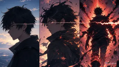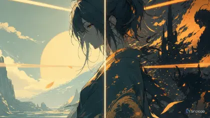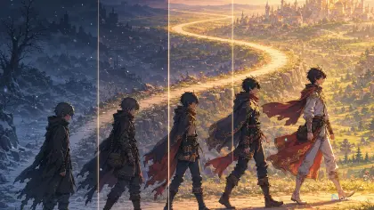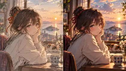
Por que seu anime com IA acaba parecendo obra de outra pessoa
Você gera um curta de fantasia à beira-mar e o primeiro frame parece empolgante — mas pelo motivo errado. Os olhos lembram um anime famoso, as nuvens lembram outro, a cidade parece um splash screen de jogo, e os uniformes parecem emprestados de uma franquia que você nunca quis referenciar. Tecnicamente é bonito, mas não parece o seu mundo. Pior ainda: o próximo Shot é bonito de uma forma completamente diferente. Este guia mostra como identificar exatamente por que aquele visual funciona e como mantê-lo em todos os Shots futuros.
Definir seu próprio estilo de anime com IA não é gritar o nome de uma influência famosa mais alto. É decidir quais traços visuais são seus, quais podem variar por cena, e quais nunca devem ser copiados. Um estilo de autoria própria tem regras repetíveis: espessura de linha, linguagem de formas, comportamento de cor, textura de fundo, padrões de iluminação, proporções faciais, nível de detalhe em figurinos e acabamento de composição.
O ArcLoop oferece um lugar concreto para essas regras: salve-as como Visual references em My Assets e todos os Shots posteriores do projeto poderão usar o mesmo conjunto. Explore Style Templates para ter receitas iniciais, construa a identidade dos personagens com Character Profile Templates e mantenha o projeto inteiro organizado em ArcLoop Worlds. O objetivo não é travar cada frame no mesmo visual. O objetivo é fazer com que muitos personagens e locações pareçam pertencer ao mesmo criador.
Este guia apresenta um fluxo de trabalho prático de guia de estilo para anime com IA. Você vai escrever uma tese de estilo, definir traços fixos e flexíveis, traduzi-los para a linguagem de prompt, testar um conjunto pequeno de cenas e revisar sem perseguir polimento aleatório.
Regras para ter um estilo que realmente é seu
Comece pela linguagem de formas antes dos efeitos de superfície. Rostos arredondados, capas triangulares, fundos verticais alongados, maquinário quadrado ou arquitetura orgânica e suave vão influenciar o mundo muito mais do que um pedido vago de "anime bonito". Formas são mais fáceis de repetir do que atmosferas.
Defina o comportamento de linha e sombra. O estilo usa linhas de tinta finas com sombras suaves, linhas de contorno grossas com cel shading chapado, linhas de esboço quebradas ou bordas limpas tipo vetor? Se o traço muda a cada Shot, a série parece montada a partir de fontes sem relação entre si.
Crie uma regra de paleta, não apenas uma lista de cores. Um estilo pode usar cores acinzentadas de vidro do mar com uma cor de sinal quente, ou pastéis gredosos com acentos pretos, ou cinzas frios interrompidos por cores de alimento pintadas. Explique como a cor se comporta sob emoção e iluminação.
Limite a densidade de detalhes. Decida onde o detalhe pertence: rostos e mãos, figurinos, maquinário, comida, fundos ou efeitos mágicos. Um estilo detalhado em todo lugar costuma ficar confuso e instável em movimento.
Descreva a técnica em vez de copiar identidades. Use termos como cel shading limpo, textura de fundo pintada à mão, granulação suave, padrão de figurino simplificado, poses de animação limitadas e luz de contorno gráfica. Evite imitar artistas específicos e atalhos de franquias protegidas.
Marque claramente os traços flexíveis. Clima, hora do dia, distância de câmera e localização podem mudar enquanto traço, proporções faciais, lógica de paleta e regras de textura permanecem estáveis. A flexibilidade só é útil quando tem nome.
Como montar um guia de estilo: da tese ao banco de testes
Escreva uma tese de estilo em uma frase. Exemplo: "Um estilo de anime costeiro de oficina, com linhas de tinta suaves, sombras em verde-azulado do mar, acentos em latão dourado e fundos que parecem feitos à mão em vez de brilhosos." Essa tese impede que o estilo vire uma pilha de adjetivos.
Liste os traços fixos. Inclua espessura de linha, proporções faciais, estilo dos olhos, estilo de sombra, textura de fundo, lógica de paleta, nível de detalhe dos figurinos e acabamento de composição. Mantenha a lista curta o suficiente para checar durante a revisão.
Liste os traços flexíveis. Estes podem mudar por cena: estação do ano, clima, iluminação emocional, distância de câmera, complexidade de adereços, densidade de multidão e intensidade de efeitos. Uma regra flexível deve indicar seu limite. Por exemplo: "Efeitos mágicos podem brilhar, mas permanecem pictóricos e nunca se tornam uma interface holográfica."
Separe estilo e identidade de personagem em dois tipos diferentes de asset em My Assets: Visual references para as regras de estilo, Characters para identidade — rosto, figurino, voz. Mantê-los separados evita que uma edição de estilo altere silenciosamente o design de um personagem, e impede que as cores específicas de um personagem se tornem a paleta do mundo inteiro. Use 90s Cel Animation Style Pack apenas se a receita combinar com sua tese; caso contrário, trate-o como um exemplo de formatação.
Gere um conjunto de teste com três cenas muito diferentes. Um close-up de quarto, um plano aberto de mercado e uma cena de ação vão revelar se o estilo aguenta variação. Se funcionar só em um retrato bonito, ainda não é um estilo de produção.
Revise apenas a camada mais fraca. Se os rostos variam, ajuste as proporções faciais. Se os fundos ficam brilhosos demais, ajuste a textura. Se a ação fica ilegível, reduza a densidade de detalhes. Não reescreva o guia inteiro porque um elemento deu errado.
Salve o guia de estilo aprovado no projeto e reutilize-o como checklist, não como roteiro. Cada prompt deve adaptar o estilo ao Shot, preservando as mesmas regras visuais centrais.
Salve as regras de estilo em My Assets, não só na sua cabeça
Mantenha as regras de estilo funcionando em vez de apenas anotadas uma vez: salve-as como Visual references em My Assets e, em seguida, traga as relevantes para um Shot da mesma forma que você referenciaria um personagem — sem redigitar a descrição a cada vez. Quando um Shot gerado não corresponde ao estilo, anote qual traço quebrou — espessura de linha, paleta, textura — para que a próxima tentativa corrija isso em vez de refazer o Shot inteiro.
Use Style Templates para não começar do zero e, em seguida, substitua os termos de estilo genéricos pelas suas próprias regras. Se um template diz pastoral em aquarela quente, decida o que isso significa para o seu projeto: granulação de papel, bordas de horizonte suavizadas, sombras de baixo contraste ou folhagem simplificada. Fique apenas com o que serve ao mundo.
Ao construir personagens, use Character Sheet Templates dentro do guia de estilo. Essa ordem importa. O estilo define a gramática visual; o character asset define a identidade. Um personagem pode ter um figurino único e ainda obedecer ao mesmo comportamento de linha, sombra e cor do restante do elenco.
Para revisão, compare diferentes tipos de cena. Pergunte se um close-up silencioso, um interior de oficina e um exterior ventoso parecem seguir as mesmas regras de produção. Se a resposta for não, revise o guia de estilo onde a inconsistência aparece. Não crie um novo estilo para cada locação.
Exemplo 1: guia de estilo para Brinebell Works, anime costeiro de oficina
Write a Visual reference set for an original 2D anime world called Brinebell Works, structured so it can be saved to My Assets.

Style thesis: coastal workshop anime with soft ink lines, sea-glass shadows, warm brass accents, handmade background texture, and gentle mechanical detail.
Fixed traits: slightly rounded faces, clear almond eyes, thin dark-brown line art, flat cel shading with soft edge shadows, muted teal and slate base colors, brass as the only strong warm accent, painted wood and salt-worn metal textures, no glossy plastic finish.
Flexible traits: weather can change from fog to sun, interiors can be warmer than exteriors, machinery can be detailed in close-up but simplified in motion, magic steam can glow softly but never become digital UI.
Do-not-copy rules: no named-artist imitation, no protected logos, no franchise uniforms, no overfamiliar mascot shapes.
Review output: a compact board with fixed traits, flexible traits, reject criteria, and three test-shot suggestions.
Esse prompt define um estilo utilizável sem depender de nomes emprestados. Salvo como Visual reference, ele dá a cada Shot posterior traços concretos a preservar em vez de uma palavra de humor vaga.
Exemplo 2: teste de estilo em três tipos de cena
Generate a three-panel 2D anime style test for the approved Brinebell Works style bible.

Panel 1: close-up of Iven Roe, a young repair apprentice with wavy black hair, gray-green eyes, tan apron, and a tiny brass measuring wheel, looking at a cracked compass in a quiet workshop.
Panel 2: wide shot of the harbor market under morning fog, canvas awnings, salt-worn wooden stalls, small brass wind meters, and muted teal shadows.
Panel 3: action beat on a cliffside lift, Iven pulling a rope lever as warm brass steam vents behind him.
Style rules: soft dark-brown ink lines, rounded faces, flat cel shading, handmade painted backgrounds, muted sea-glass palette, brass as the only strong warm accent.
Constraints: keep the same visual grammar across all panels, no glossy 3D surfaces, no random neon, no copied logos, no text, no watermark.
O teste força o estilo a funcionar além de um único retrato. É aí que guias de estilo fracos costumam quebrar.
Exemplo 3: corrigir uma camada sem reescrever o guia inteiro
Revise the selected Brinebell Works market shot with a style-only adjustment.

Current issue: the character and layout are correct, but the background looks too glossy and the palette introduces bright purple signs that do not belong to the style bible.
Preserve: harbor market composition, foggy morning, canvas awnings, wooden stalls, brass wind meters, character positions, and camera angle.
Change only style traits: replace glossy surfaces with handmade painted wood and salt-worn metal texture, remove purple signs, return shadows to muted teal and slate, keep brass as the only strong warm accent.
Output: one 2D anime market shot that matches the approved Brinebell Works style bible.
Negative constraints: no face redesign, no new props, no text, no logo, no photorealism, no neon accent colors.
Essa revisão não reconstrói a cena. Ela repara apenas a camada de estilo que se desviou.
Formas de um guia de estilo desmoronar
O maior erro é definir estilo por nomes famosos em vez de traços visíveis. Um estilo de produção precisa de regras repetíveis que a equipe possa inspecionar: linhas, formas, comportamento de cor, sombras, textura e densidade de detalhes.
Outro erro é tornar o conjunto de referências amplo demais. Traços como "fofo, cinemático, retrô, fantasia, detalhado, suave, dinâmico" são vagos demais para o modelo segurar — nada em um Shot gerado vai claramente passar ou reprovar por causa deles. Corte a lista até que cada traço seja algo que você consiga verificar de verdade em uma tomada.
Criadores também esquecem o movimento. Um estilo que funciona em imagens estáticas pode falhar em vídeo se os padrões de figurino, detalhes do cabelo ou textura de fundo forem densos demais. Teste pelo menos um Shot de ação antes de aprovar.
Um quarto erro é confundir consistência com mesmice. Seu estilo pode suportar diferentes climas, ambientes, emoções e personagens. A gramática fixa permanece estável enquanto as escolhas específicas de cada cena variam.
Por fim, não deixe o polimento sobrepor a autoria. Uma tomada muito polida que parece emprestada não é o objetivo. Rejeite e fique com a versão que parece sua.
Perguntas frequentes
O que pertence a um guia de estilo de anime com IA?
Inclua uma tese de estilo, traços fixos, traços flexíveis, comportamento de cor, regras de linha e sombra, regras de textura, limites de densidade de detalhes e critérios de rejeição. Mantenha-o curto o suficiente para revisar durante a produção.
Posso usar style templates sem perder originalidade?
Sim, se você os tratar como estruturas iniciais. Substitua os traços genéricos pela sua própria linguagem de formas, lógica de paleta, regras de textura e limites de não-cópia.
Como saber se meu estilo está pronto para produção?
Teste em pelo menos três tipos de cena: um close-up, um ambiente aberto e uma cena de ação. Se a mesma gramática visual sobreviver às três, o estilo está muito mais perto de ser utilizável.
Todo personagem deve usar a mesma paleta?
Não. Os personagens podem ter cores de identidade individuais, mas devem seguir o comportamento geral de cor do estilo. Por exemplo, o latão pode continuar sendo o único acento quente forte em todo o mundo.
Como perceber o desvio de estilo antes que ele fique gravado em uma cena?
Mantenha as Visual references vinculadas ao projeto e referencie-as a partir de cada Shot, da mesma forma que você referenciaria um character asset. Como a referência e a tomada gerada ficam no mesmo lugar, um desvio aparece quando você as compara — enquanto ainda há tempo de corrigir a camada certa em vez de refazer o Shot inteiro.