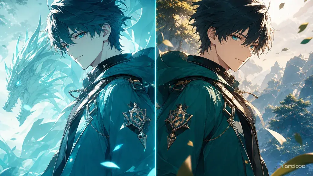
Why writing 'keep the colors' doesn't work
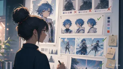
Color shift usually announces itself late. Your first character sheet has a calm olive jacket and muted red scarf. Three shots later, the jacket turns mint, the scarf becomes neon pink, and the background lights push every skin tone toward orange. The clip may still look polished, but it no longer belongs to the same character or series.
The fix is not simply writing "keep the same colors" harder. You need to tell ArcLoop which colors are identity colors, which colors belong to the environment, which colors can be affected by light, and which colors must not drift between drafts. A good color repair prompt reads like a short palette note attached to the shot description.
Use this guide when approved colors start drifting between a character asset, the storyboard, and the generated video. You can start from Style Pack Templates for a style reference, keep the approved look bound to the asset in ArcLoop Worlds, and run a focused repair pass before the color problem spreads across a sequence.
Rules for separating local color from light
Separate local color from lighting color. Local color is what the object is: navy coat, ivory scarf, copper boots. Lighting color is what hits it: sunset rim light, blue screen glow, green aquarium bounce. If you do not separate them, a correction can accidentally erase the mood.
Name a palette hierarchy. Main neutral, character accent, environment accent, and highlight color should not all fight for attention. Color shift often gets worse when every object is described as vivid.
Protect identity colors. Hair color, eye color, costume base, and signature prop color should remain stable unless the story beat is about a transformation. If the approved scarf is rust red, call it rust red in every related prompt.
Limit saturation. "Vibrant anime colors" can push every pass toward candy brightness. Use phrases like muted base colors, controlled accent, low saturation background, or warm highlights only on the lamp.
Use references for comparison, not decoration. A Visual reference asset or approved character sheet should answer a specific question: what hue, value, and saturation must survive? If the reference is only "inspiration," the next draft may remix it.
Review color in context. A jacket can look different under moonlight and still be correct. The real failure is when the local color changes category, such as navy becoming purple, cream becoming yellow, or auburn hair becoming pink.
How to write a color repair prompt
Start by identifying the drift. Write the current failure in plain words: "the teal uniform became bright cyan," "the background neon polluted the face," or "the prop changed from brass to silver."
Choose the approved source. Use the strongest reference you have: the character asset, a Visual reference asset in My Assets, or a previous shot that matched the intended look. Do not make a random new image the color authority.
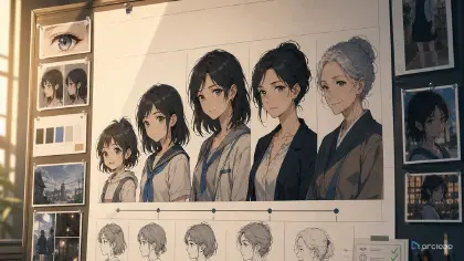
Write a four-part palette note. Include base colors, accent colors, lighting color, and forbidden drift. For example: "base is charcoal and cream, accent is dull red, lighting is cool morning blue, avoid magenta or neon cyan."
Place color rules beside the object they control. Character palette belongs with the character description. Environment palette belongs with the setting. Lighting color belongs with the camera or mood note.
Generate a cheap comparison pass. In ArcLoop, keep the approved asset on the canvas and ask for a draft that proves color stability before adding camera tricks, particles, or final polish.
If only one color drifts, repair only that color. Do not rewrite the whole shot. A targeted line such as "restore the scarf to muted rust red while keeping the existing pose and background" is cleaner than a full prompt rebuild.
Use City Pop Vaporwave Poster when you need to test a deliberate palette recipe. For anime shot continuity, pair the repair with How to Write 2D Anime Animation Prompts.
Let ArcLoop check pixels against the approved palette
Palette rules don't have to be rewritten from memory for every new shot. Build the character as an asset in My Assets, bind a Visual reference for the approved palette as its reference image, then generate each new draft in Canvas next to that asset — you're checking pixels against the actual approved reference, not against what you remember the color looking like.
When creating a series, set a simple palette contract early. Decide which colors are locked identity colors and which can respond to lighting. A night scene can tint shadows blue, but it should not invent a new costume palette.
For local color repair, regenerate just that layer. If the face, pose, and action are good, ask for a color-only pass: preserve composition, preserve motion, restore the approved palette from the asset. This avoids burning retries on unrelated changes.
For team review, write the rejection reason as a color note: "boots shifted from warm brown to black," "background saturation overpowered the character," or "green key light changed hair identity." Specific notes make the next draft cheaper.
Example 1: Restoring a Museum Guard Palette
Color repair pass for a shot featuring @Vale Ardent, a night museum guard. Palette note from her character asset: dark pine-green uniform coat, cream shirt, dull brass buttons, warm brown gloves, black shoes, deep auburn hair. Setting: marble museum corridor after closing, with cool moonlight from high windows and one warm desk lamp near the frame edge.
Problem to fix: the latest draft pushed the coat toward bright emerald and made the brass buttons look silver. Keep the existing medium shot and quiet walking pose, but restore the local colors. The coat must read as dark pine green even under moonlight. Brass buttons may catch warm highlights but should not become white or chrome. Moonlight can cool the shadows; it must not recolor the uniform.
Style: clean cel-shaded anime, restrained museum palette, low saturation background, warm lamp accent only. Preserve Vale's face, hair, coat shape, gloves, and screen direction. No neon green, no purple coat, no silver buttons, no oversaturated blue shadows, no text, no logo, no photorealism.
This prompt names the approved colors and the exact drift. It allows lighting while protecting the uniform's local color.

## Example 2: Aquarium Glow Without Skin Shift

```text
Create a 6-second 2D anime shot for Nerin Saye, an original aquarium repair diver off duty. Character anchors: short sandy hair, teal work jacket, white undershirt, orange waterproof watch, navy shorts, and gray deck shoes. Setting: public aquarium service corridor, large tank windows casting soft blue-green light across the wall.

Color goal: keep Nerin's skin tone natural and keep the jacket teal, not cyan. The blue-green aquarium glow should affect the wall, floor reflections, and the shadow side of the jacket only. The white undershirt stays off-white, not blue. The orange watch is the only saturated accent and should remain visible during the whole clip.

Action: Nerin stops beside the tank glass, raises her wrist to check the watch, then looks toward a shadow moving behind the water. Camera locked medium shot, subtle fish-light movement in the background. Use soft 2D anime compositing and calm underwater reflections. No full-scene color wash, no neon saturation, no green skin, no changing jacket hue, no text, no extra characters.
Here the lighting is the point of the scene, so the prompt tells ArcLoop where the glow may land and where it must not.
Example 3: Festival Lantern Accent Limit
Palette verification pass for a shot featuring @Kett Rowan, a paper-lantern maker in a small hill festival story. Palette note from the character asset: smoke-gray kimono jacket, faded indigo trousers, straw sandals, black hair tied low, one vermilion lantern hook carried in the right hand. Environment palette: dusk violet sky, warm paper lanterns, dark cedar stalls.
Create a 7-second 2D anime medium full-body shot. Kett walks between quiet festival stalls, notices one lantern dimming, and lifts the vermilion hook toward it. Color rule: vermilion belongs only to the hook and tiny lantern marks. Do not spread vermilion into the jacket, sky, skin, or stall shadows. Keep the kimono jacket smoke gray with soft warm highlights from nearby lanterns.
Camera: slow side track, full figure visible, no cuts. Style: restrained festival colors, clean line art, gentle lantern bloom. Preserve the approved palette and prop placement. No red kimono, no orange skin, no rainbow lanterns, no oversaturated background, no text, no watermark.
This prompt limits the accent color. That makes the lantern hook memorable instead of letting red leak into the whole frame.

## The most common ways color repair goes wrong

The first mistake is confusing mood with palette. A scene can be dramatic without turning every color into high-contrast neon. Name the mood separately from the actual hues.

Another mistake is correcting lighting by flattening it. If a night scene has blue shadows, do not remove the lighting. Protect the local colors while letting believable light affect edges and shadows.

Creators often approve an image without writing down the palette. If the only record is "looks good," later prompts have nothing stable to repeat. Add a short palette note to the ArcLoop project.

Many repair prompts overreact. If the orange watch drifted, fix the watch. Rewriting the entire character can break pose, expression, and costume.

Finally, do not let style references silently change color authority. A style pack can guide rendering, but the approved character palette should decide identity colors.

## FAQ

### Why do colors shift between AI video drafts?

Colors shift when the prompt mixes identity colors, lighting colors, and style adjectives without a hierarchy. Strong environmental light or vague words like vibrant can also push the palette away from the approved design.

### Should I list exact hex codes?

Use names and relationships first because they are easier to judge visually. Hex codes can help a palette board, but the prompt should still say which objects own those colors and how lighting may affect them.

### How do I keep one accent color from spreading everywhere?

Name the accent owner. For example, "vermilion only on the lantern hook" or "orange only on the watch." Then add a negative boundary that prevents the accent from recoloring clothing, skin, or background shadows.

### How do I fix color shift without rebuilding the whole shot?

Keep the approved draft on Canvas, ask ArcLoop to preserve composition and action, then run a focused color repair pass against the palette in the approved character asset.

### When should I create a new palette card?

Create one when several shots need to share a look, when character colors keep drifting, or when a team needs a single source of truth for base colors, accents, lighting rules, and forbidden saturation.