Why a prop without a job breaks the design
The fastest way to lose a good anime shot is to treat the important prop like background decoration. The first draft gives your courier a shell compass. The second draft turns it into a pocket watch. By the third draft, the character is holding a glowing coin that nobody can grab the same way twice. The face may still look fine, but the story has already slipped because the object that was supposed to carry the clue keeps changing its shape.
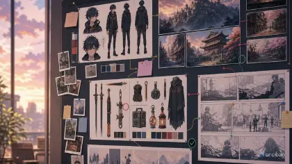
Anime prop design needs a small production asset before it needs polish. A prop should have a readable silhouette, a front view, a side view, a size relationship to the hand or body, material notes, a function, and one mark that can survive later shots. If the object opens, folds, lights up, records a message, unlocks a door, or proves a character's trade, that action belongs in the prompt.
This guide shows how to write prop prompts for reusable anime objects: charms, tools, weapons, school items, magical devices, food containers, instruments, and story clues. When the object belongs to a character, start from Character Profile Fields and build it into that character asset. When the prop is part of a larger setting, open ArcLoop Worlds instead.
Rules for prop design that holds across shots
Design the silhouette before the surface detail. A viewer should recognize the prop in a half-second shot even if the engravings disappear. A crescent handle, split blade, square clasp, long ribbon, lopsided hinge, or oversized pull ring will hold better than a paragraph of tiny ornament.
Give the prop a physical scale. "Small brass charm" can drift between necklace, belt buckle, and hand tool. "Palm-sized brass tide compass, wider than two fingers, hanging from a blue cord at the character's hip" gives the model and reviewer a stable size check.
Connect the material to the world. A glass compass in a fishing town, a ceramic mask in a kiln city, and a paper talisman in a shrine school all imply different handling. Material is not just texture; it tells you whether the prop chips, bends, floats, burns, rings, or reflects light.
Show how the character uses it. A prop that never enters the action can be pretty but useless. Decide whether the character grips it, opens it, reads it, wears it, hides it, repairs it, or notices it reacting to the scene.
Keep one defect or story mark. Scratches, mismatched stitching, a replaced screw, a cracked rim, a faded ribbon, or a missing bead makes the prop easier to identify across shots. One mark is enough; a dozen marks will become noise.
Separate design view from action view. A clean prop sheet can use front, side, and scale diagrams. A video shot should show one readable use of the prop. Do not ask one short clip to be a full catalog page and a dramatic scene at the same time.
How to write a prop prompt: from story role to reuse
Start with the prop's story role. Write one plain sentence: "This compass proves the harbor routes are controlled by tides, not maps." That sentence decides what the prop must show and what details are optional.
Choose the owner. Props feel stronger when they belong to a specific character. Add two identity anchors from the character asset, then explain how the prop sits on the body: clipped to a belt, tucked under a sleeve, strapped to a case, carried with both hands, or worn as a pendant.
Define the asset view. For first design passes, ask for front view, side view, back view if needed, scale note, simple material callouts, and one in-hand pose. Avoid fake readable labels because generated text can clutter the image. Use blank callout space instead if you need annotation later.
Define the action view. Once the asset reads, write a shot prompt that uses the prop in one moment: the lid snaps open, the needle points away from north, the cracked lens catches sunset, or the latch refuses to close. Keep the camera close enough to see the object but wide enough to see the hand.
Add constraints that protect reuse. Use phrases such as consistent silhouette, same clasp shape, same color cord, no changing into another object, no random symbols, no unreadable tiny text, no extra fingers, and no hidden grip.
Review the draft on the canvas before you polish. If the prop's silhouette is wrong, repair the asset sheet. If the silhouette is right but the action is unclear, repair the shot card. For prop-heavy scenes, Reference Type Per Shot helps keep the design reference separate from the camera reference.
Keep prop assets in ArcLoop, not buried in prompts
ArcLoop is useful here because the prop can live as its own asset in My Assets, next to the character asset it belongs with, instead of surviving only as a loose sentence in a prompt history. Build the prop once, bind its reference images, approve the shape, then pull it into any shot with an @ reference when you generate story shots in ArcLoop Worlds.
Use one asset for the approved prop and one card for the shot. The prop asset controls silhouette, size, material, marks, and allowed variations. The shot card controls framing, action, lighting, and duration. When a take fails, this split tells you what to fix without rewriting the entire brief.
The practical review order is simple: identity, grip, function, readability, polish. Identity asks whether the object is still the same object. Grip asks whether the character could physically hold or wear it. Function asks whether the shot shows why it matters. Readability asks whether it works at mobile size. Polish comes last.
Here is how to set this up inside your project before you generate shots:
- Open your IP Project and go to My Assets. Click to create a new prop asset — give it the same name you will use in shot descriptions (for example, "tide compass").
- Upload your reference image to Library, then open the asset and click Bind. Set the clearest front-view image as Main image. If you have a side view or an open-lid view, bind those as Reference images so the silhouette and marks stay fixed across generates.
- Go to your Episode and click Generate Shots. The AI will break the episode into shot cards.
- Open a shot card and type
@followed by the prop name to reference it — for example,@tide compass. Only write what is new in this specific shot: the action, the framing, the lighting. The silhouette and material notes live in the asset; you do not need to repeat them here. - Generate an image first to confirm the prop reads correctly at shot scale. If the silhouette drifts, update the Main image binding on the asset before generating video.
- Once the image looks right, generate the video. For multiple shots in the same episode, open AI Chat Panel and send:
Generate videos for Shots 1, 2, and 3.Then bring the approved clips into Edit to arrange or replace takes on the timeline.
Example 1: Tide Compass Prop Design Sheet
Medium shot of @Lio Arven standing at the harbor edge at low tide, the tide compass open in both hands. He tilts the shell lid toward the waterline; the cloudy glass lens catches the grey morning light. Camera stays level with his hands, slightly below eye line. The chipped pearl near the needle and the blue cord loop are visible. Hold three seconds before cutting. Soft overcast light, no shadows from above, quiet ambient sound of water pulling back over stone. No text overlays, no extra hands, no new props replacing the compass.
This prompt makes the prop reusable before asking for a finished scene. The chipped pearl and cord loop become continuity anchors.
Example 2: Tea Lantern Prop in a Character Shot
Medium close shot of @Hana Pell at a narrow market stairway just before dawn, paper awnings closed, steam drifting from kettles on the steps above her. She lifts the ceramic tea lantern from her satchel with both hands, twists the square bamboo handle once, and warm tea light blooms through the leaf-shaped holes in the glaze. Camera sits front-left, hands and lantern fully in frame. The crack on the lower rim and the green cord knot stay visible throughout. Soft cel shading, gentle steam, quiet morning color palette. No text, no extra fingers, no shape change to the lantern.
The object has a grip, a trigger, and a visible effect. That is more useful than saying "magical lantern" and hoping the design survives.
Example 3: Broken Signal Harp Revision Pass
Waist-up shot of @Oren Vale on a rooftop at dusk, adjusting the folding harp against his patched shoulder bag. He grips the black lacquer frame with one hand and presses the hinge flat with his palm until the five silver strings lie flush against the bag. The missing corner inlay and the red wax repair mark near the hinge stay visible. Camera is at chest height, slight three-quarter angle. Warm rim light from the left, city ambient sound low underneath. No fake writing on the frame, exactly five strings, no redesign into a weapon, no floating parts.
This is a narrow repair prompt. It keeps the approved idea and fixes only the size and string-count failure.
The most common ways prop design goes wrong
The biggest mistake is inventing the prop inside every shot. If the object matters for a series, design it once and reuse the approved asset. Otherwise each prompt will quietly replace it with a new cousin.
Another mistake is overdecorating small objects. Tiny runes, layered charms, micro gears, and complex stickers may look interesting in a still frame, but they often blur or mutate in motion. Choose one bold shape and one story mark.
Creators also forget the hand. A prop that cannot be gripped, worn, opened, or placed will fail as soon as a character interacts with it. Add an in-hand scale pose before generating dramatic use.
A fourth mistake is mixing asset-sheet language with video language. "Front view, side view, and back view" belongs in the design pass. "She opens the latch while turning away" belongs in the shot pass. Split them.
Finally, do not let polish hide a wrong object. If the compass became a coin, reject it even if the lighting is beautiful. Prop continuity is part of story continuity.
FAQ
How detailed should an anime prop design prompt be?
Detailed enough to lock the silhouette, size, material, function, and one continuity mark. If a detail will not be visible or reused, leave it out of the first pass.
Should I design the prop before the character shot?
Yes, when the prop matters to the story. Build the prop sheet first, then use the approved design in the character shot. For disposable background items, a short description inside the shot prompt is enough.
How do I keep a prop consistent across episodes?
Build the prop once as a prop asset in My Assets, bind its reference images so the silhouette and marks stay fixed, and reuse it with an @ reference in every episode instead of changing anything but the scene action. A bound asset is easier to reuse than a long copied prompt.
What if the prop looks good but the character holds it badly?
Add a handling pass. Ask for one pose that shows the grip, strap, hinge, clasp, or opening motion. If the hand cannot explain the object, the audience will not understand it either.
How do I turn a prop idea into a reusable asset?
Build it as a prop asset in My Assets, bind its reference images, then call it into any shot with an @ reference. Because the asset lives in the same IP Project as your characters and shots, the object stays stable while you build more scenes from it.