Your video cover will usually appear much smaller than it does in your editor. In a mobile feed, background details disappear, small text blurs, and facial expressions become harder to read.
Before opening an AI poster generator, decide what needs to remain visible: a face, a relationship, or an object that suggests something is wrong. Build the rest of the image around it.
Five fictional posters illustrate the design decisions below.
1. Find the detail that carries the story
Imagine an AI short film about a violinist whose performing career has been interrupted. A violin and a broken bow can carry the idea: the instrument establishes the profession; the break suggests a life disrupted.
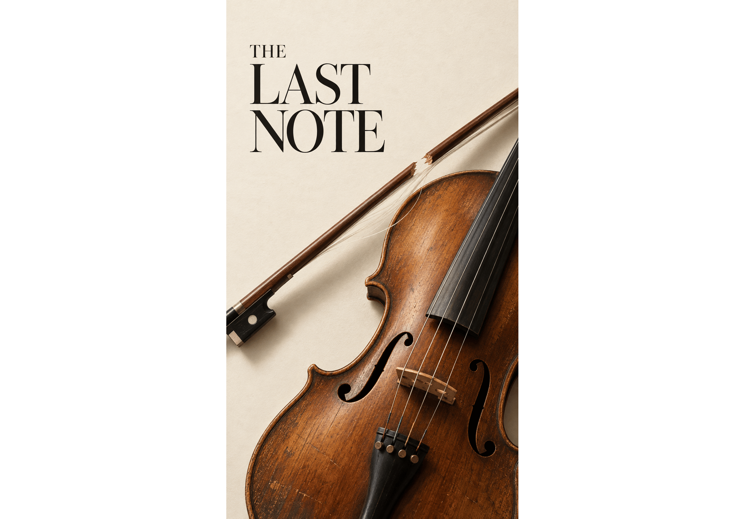
The Last Note: The diagonal bow crosses a quiet background, leaving its broken edge clearly visible.
For visual storytelling through objects, condition matters. Damage, abandonment, and signs of repeated use suggest different stories.
For a short movie poster, choose one focal detail that hints at the backstory. Enlarge the revealing detail, place it against a simpler background, and check it at thumbnail size. Otherwise, viewers may see only a beautiful instrument.
Check the idea against the script. The visual clue on the film cover should make sense once someone watches the film.
2. Give people a clear place in the frame
Placement does much of the work in short film poster design. Decide whom viewers should notice first, then arrange the cast around that choice.
Center a single protagonist
A centered character poster concentrates attention on one person’s state of mind. Their gaze, posture, and equipment help establish who they are.
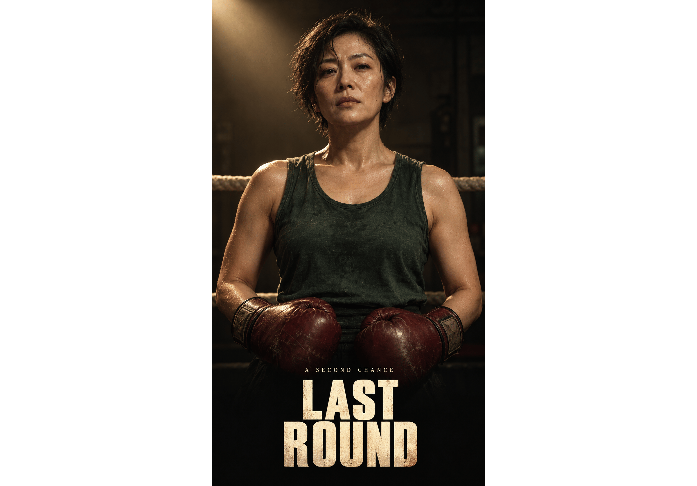
Last Round: The boxer faces the viewer. Worn gloves occupy the lower frame, while the darker background keeps her face and shoulders distinct.
For this comeback story, a quiet stance leaves room to study her expression. Keep the face large enough to read on a phone screen, then fit the background and title around it. If the silhouette blends into the setting, adjust the local contrast or add a restrained rim light.
Give an ensemble a hierarchy
Start an ensemble movie poster with a lead figure. Vary the supporting characters’ height, distance, and brightness so each has a distinct role.
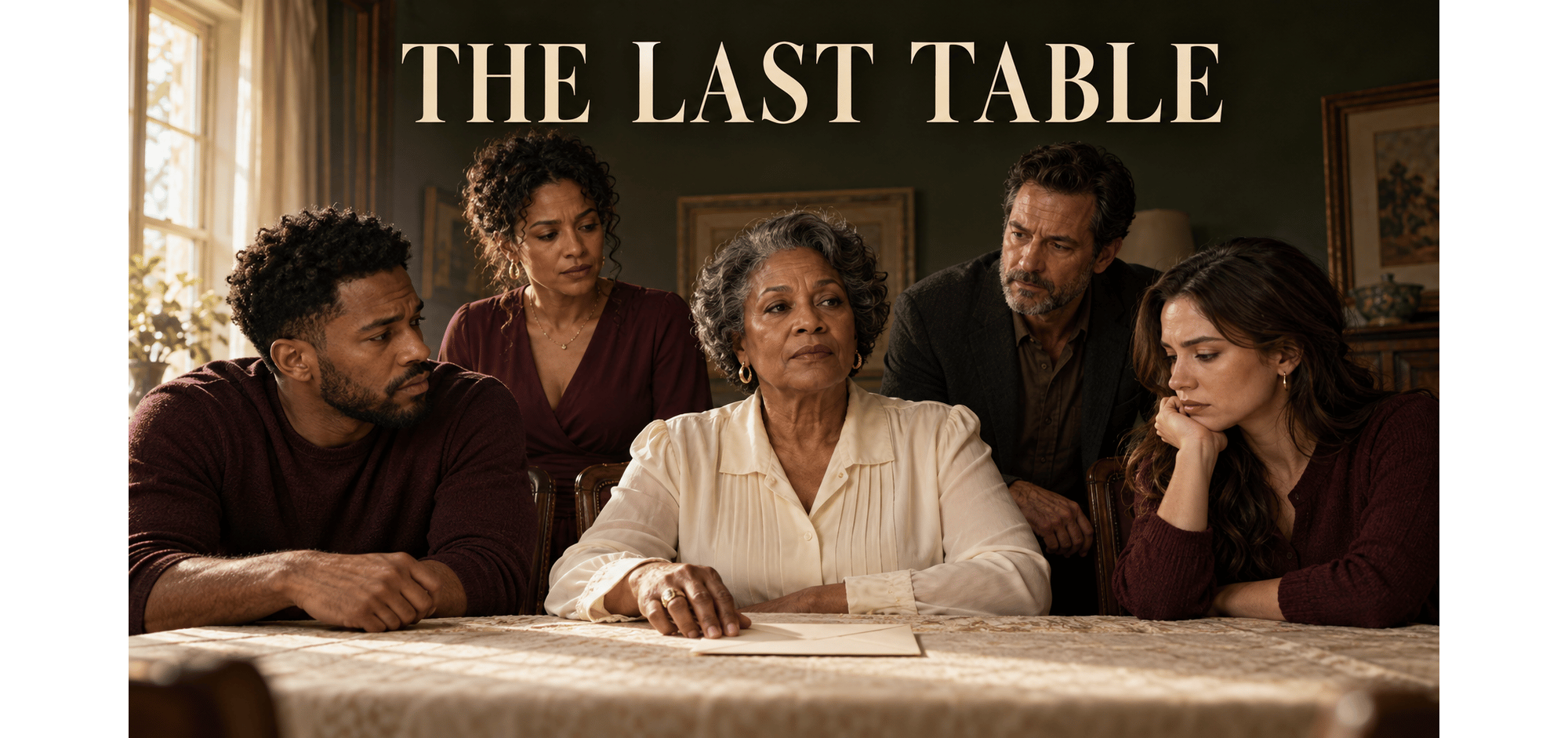
The Last Table: A pale blouse draws attention to the central woman. The envelope and surrounding glances suggest a shared source of tension.
In drama cover design, eyelines and gestures can reveal relationships. Someone leans closer; another watches; a third looks away.
For a short drama cover, add supporting characters one at a time. Check whether each addition tells viewers something or simply fills the frame.
3. Recompose for 9:16 and 16:9 covers
A 9:16 vertical cover (for Shorts, Reels, or TikTok) and a 16:9 YouTube thumbnail often need different arrangements of the same information.
9:16 vertical cover
- Composition: Use height: portraits, staircases, figures on different levels.
- Subject scale: Keep faces and important objects readable within the narrow frame.
- Title space: Plan a clear area above or below the action.
16:9 horizontal cover
- Composition: Use width: opposing characters, ensembles, a person and a destination.
- Subject scale: Keep the subject from disappearing into a wide background.
- Title space: Use space beside the subject or a separate title band.
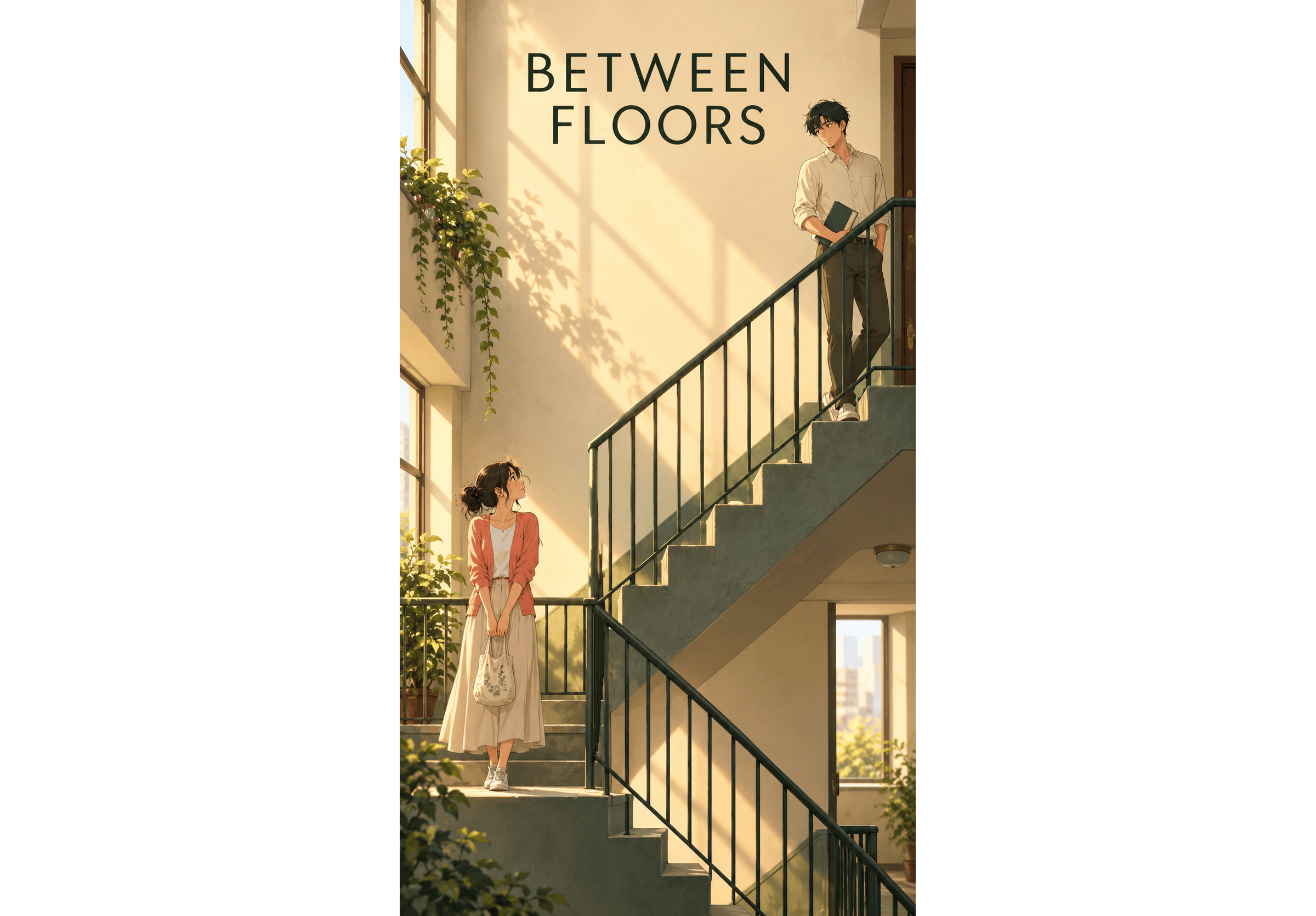
Between Floors: Separate landings establish distance between the characters. The railing guides the eye upward.
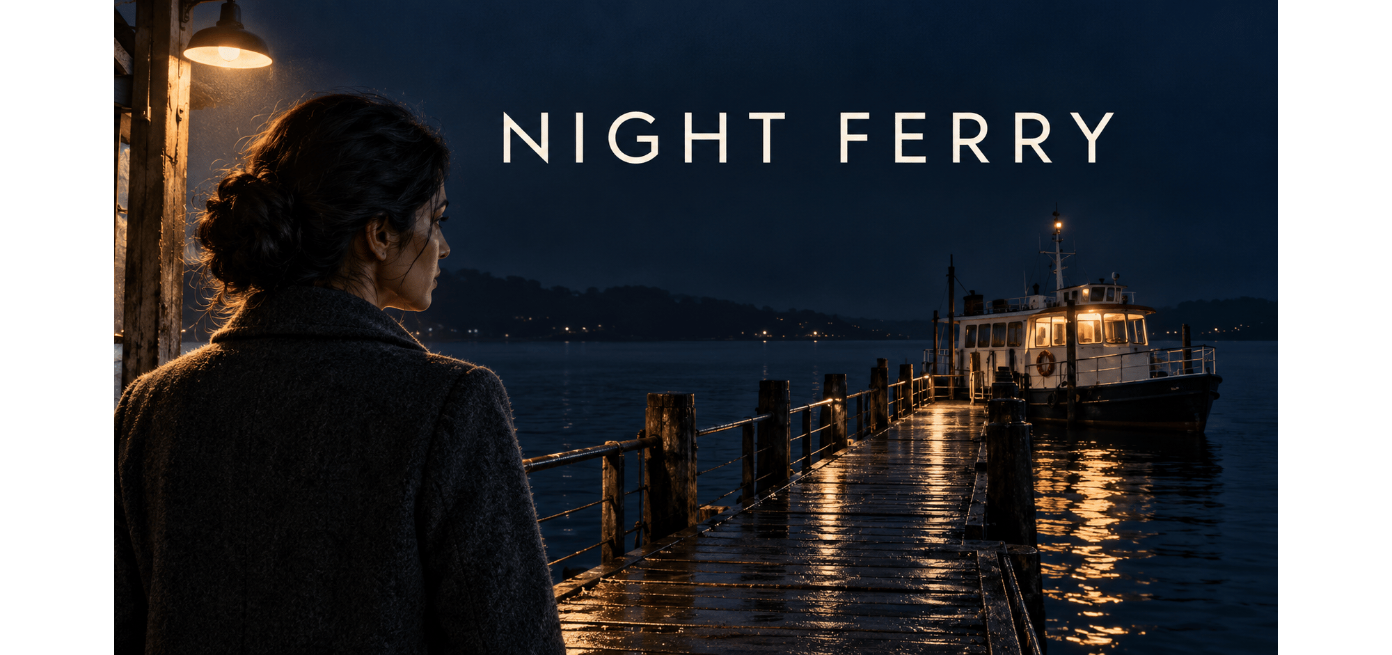
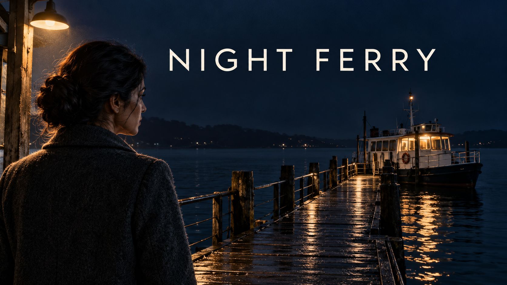
Night Ferry: The woman and boat occupy opposite sides, connected by the pier. Their separation raises a question about why she is waiting.
Cropping Night Ferry vertically could remove the woman or the boat. Repositioning the ferry behind her shoulder would keep both in the narrower 9:16 frame.
Preview the actual publishing surface. Player controls, captions, and feed crops can obscure important details near the edges.
4. Improve the finish through light, color, and detail
An AI movie poster can feel artificial for specific reasons: inconsistent lighting, a hand that does not grip its prop, or a background as sharp and bright as the face.
Start with the light source. An ensemble should share a coherent lighting setup. In Night Ferry, the lamps warm the woman’s outline, wet boards, and nearby water; the distant sky stays cooler.
Next, check contrast. Reduce background brightness or detail where it competes with the expression, gesture, or object that matters.
Choose color grading that suits the story. The Last Note uses wood tones and ivory for an intimate drama. Cinematic poster design does not require every scene to share the same dark palette.
Inspect hands, prop geometry, fabric folds, and shadows at full size. Film grain can change the finish, but structural AI generation errors need their own corrections.
For an AI anime poster, check linework, shadow shapes, and character proportions against the episode.
5. Plan the title before generating the image
Movie poster typography affects composition. Decide roughly where the title belongs before generating the artwork.
Last Round uses compact, heavy lettering; The Last Note gives a finer serif font more breathing room. Choose a font style that fits the film genre, then check its readability.
Keep the title first when simplifying text. Billing credits suited to full-size short film posters may become clutter in an AI video thumbnail.
Whatever movie poster maker you use, keep text editable. Changing a title, translation, or line break should not require regenerating the artwork. For a series, reuse a short film poster template.
Build a custom movie poster from a video still or your project’s character and scene references. Arcloop’s GPT Image 2 tool supports generating images from text and editing with references. When using an AI movie poster generator, make each revision specific: enlarge the character, simplify the background, or leave more title space.