A character turnaround sheet shows the same character from the front, the side and the back, so every later shot starts from one shared visual reference. The point is recognizability: the character should still read as the same person as they turn, as the framing changes and as shots cut. For motion comics, short dramas and longer serialized stories, that reference also becomes a reusable asset — one approved design holding an appearance together across shots and clips generated separately.
1. What a character turnaround sheet is for
A front portrait alone leaves much undefined: the profile, the back of the head, the rear of the outfit. A turnaround designs those areas directly instead of leaving the model to fill them in. And reusing one approved design across shots gives each generation a common starting point rather than a fresh text description every time.
Which is why the sheet is worth getting right before you animate anything. Face, hair, body proportions and clothing should agree across every view, and the small identifying features should be legible at the size they appear. If the reference itself contains different faces, an accessory that switches sides, or two conflicting readings of the same garment, those ambiguities travel straight into the input. A turnaround gives you a clear, reusable design; how far it survives across shots still depends on the video model and on what it actually generates.
The cases below follow one adult webtoon woman through a basic turnaround, two alternative layouts and an outfit change, then hand the same four-panel approach to a photorealistic man in a single multi-shot driving video. Every image and video here is an actual generated output, and every original English prompt is printed in full beneath its case caption so you can read and copy it. This is a walkthrough, not a controlled comparison of layouts.
2. From a short brief to a basic turnaround
Start with a short brief: style, body type, face, hair, clothing, and a handful of details that make the character recognizable. You can develop the design in Arcloop’s AI Character Generator. If you already have an approved character image, use it as the reference wherever the tool accepts one.
Describe one whole character, not three separate designs. Let the model propose ordinary construction for the areas you cannot see, and specify side or back details only where you actually care: an open back, a particular collar, a clip on the character's own left.
For the core reference, use a natural, balanced stance: shoulders level and relaxed, head upright, hands resting at the sides, a small gap between the arms and torso so hands and clothing stay readable. Hold the same pose in every view. Skip the raised shoulder, the tilted hip and the dramatic action pose, and use an A-pose or T-pose only when the production workflow downstream actually expects one.
Generate the front, side and back together
Ask for full-body front, side and back views in one pass, at the same scale, feet on one baseline, plain background, and the whole head and shoes inside the frame each time.
Our starting character: midnight-blue hair, violet eyes, a dusty-lilac cropped blazer, white top, black trousers, ankle boots. The only back-specific instruction is that the blazer stays plain — no hood, no emblem.
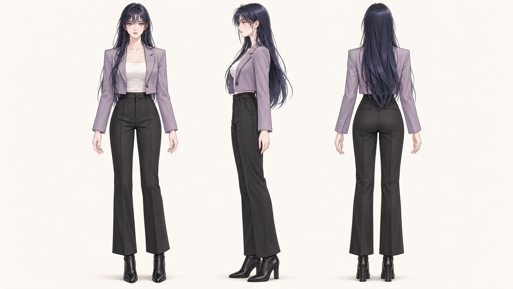
Case 1 — The original text-to-image result, generated once without an input image or post-generation image edits. The canvas is approximately 16:9.
Actual generation prompt:
Create a 16:9 landscape character turnaround sheet in elegant Korean webtoon style: delicate linework, luminous soft cel shading and refined facial features. An original beautiful adult woman with long straight midnight-blue hair, wispy bangs, violet eyes and a slim graceful build, wearing a dusty-lilac cropped blazer over a white top, high-waisted black tailored trousers and sleek black ankle boots. The blazer has a plain back with no emblem or hood. Show the same character in full-body front, side profile and back views together in one row, at the same scale, in a relaxed standing pose with a neutral expression. Feet aligned, arms slightly away from the torso, all heads and boots visible with comfortable margins. Plain light warm off-white background, even lighting. No weapons, text, labels or decorative panels.
A tidy sheet is not automatically a correct one, so check it. Here the long hair covers most of the jacket's back. If a hidden seam or fastening matters, pin it down with an extra reference rather than hoping the model reads through the hair.
3. Advanced character reference techniques
Make the facial reference clear enough to read
A face gets very small inside a full-body view. A closer portrait restores readable information about the eyes, face shape and hairline without demanding a pile of new angles. The aim is to make the approved face clearer and to confirm that the front and the profile agree — not to introduce a new set of features in the close-up.
For a local fix, use a mask or a selected region where the tool supports it. Name the detail you want changed and the features you want kept, then inspect the surrounding area and save a new version. Measurements, color specifications and design notes belong in the human-readable master; the image you feed the model can stay simple.
Match the layout to the style and the detail you need
For motion comics and stylized 2D work, start with a plain three-view sheet. As long as the face stays readable, it carries the facial design along with the body and outfit, no elaborate layout required. Add a closer face reference if the generated image tells you it needs one.
For film-oriented work, detailed 3D characters, and photorealistic or live-action-style characters, reach for a face-and-body four-panel layout when facial detail matters. The larger front and profile portraits buy room for eye shape, nose, jaw structure, hairline and skin, while the lower panels still carry the full body and clothing.
That is a judgement about how much information a reference can carry, not a measured advantage in video generation. Read it against what you can actually see in the image, and resist the assumption that every 2D project, or every 3D one, needs the same thing.
A vertical four-panel alternative
This version works on a roughly 9:16 page. A short upper row holds front and profile head portraits; a taller lower row holds front and profile full-body views. The panels differ in height because they hold different things.
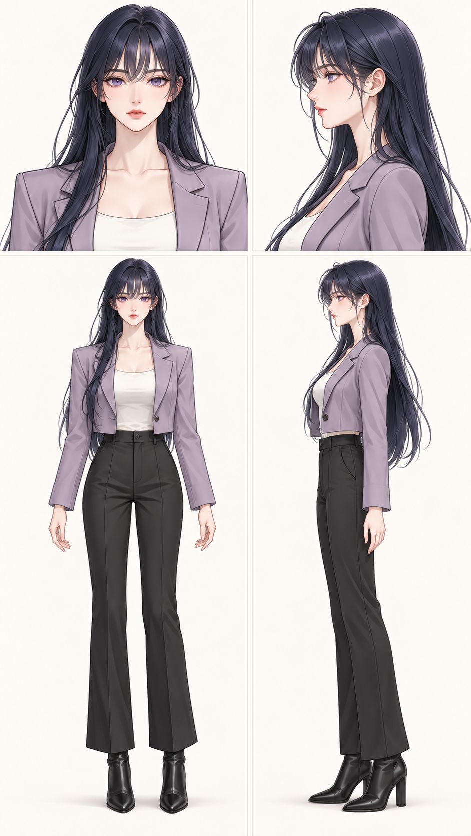
Case 2A — A compact layout that gives the face and body their own space.
Actual generation prompt:
Using the attached image as the exact character identity, outfit and Korean webtoon style reference, create a 9:16 portrait character reference sheet with exactly four unequal-sized panels. The top row takes roughly one third of the page height: a larger front-facing head-and-shoulders portrait on the upper left and a true side-profile head-and-shoulders portrait on the upper right. The bottom row takes roughly two thirds of the height: full-body front view on the lower left and full-body true side profile on the lower right. Keep the two full-body figures at the same scale, with aligned feet and every head and boot fully visible. Preserve the same adult woman's violet eyes, long midnight-blue hair, wispy bangs, lilac cropped blazer, white top, black tailored trousers and black boots in all four views. Neutral expressions, relaxed standing pose, delicate linework and soft cel shading. Plain warm off-white background with narrow clean gutters between panels. No text, borders, props, expressions grid or back view.
The goal is to make what you have easier to see, not to pack the page. This version shows no back — add one when the shot or the outfit calls for it, knowing that six panels on a fixed canvas means more density and less space per image. It has not been run against the three-view sheet in video generation.
Photorealistic example: a middle-aged man
This character was generated from scratch on the same unequal four-panel plan: front and profile head portraits above front and profile full-body views. Short salt-and-pepper hair, stubble and visible skin texture give the close-ups a concrete job — making age and facial structure legible.
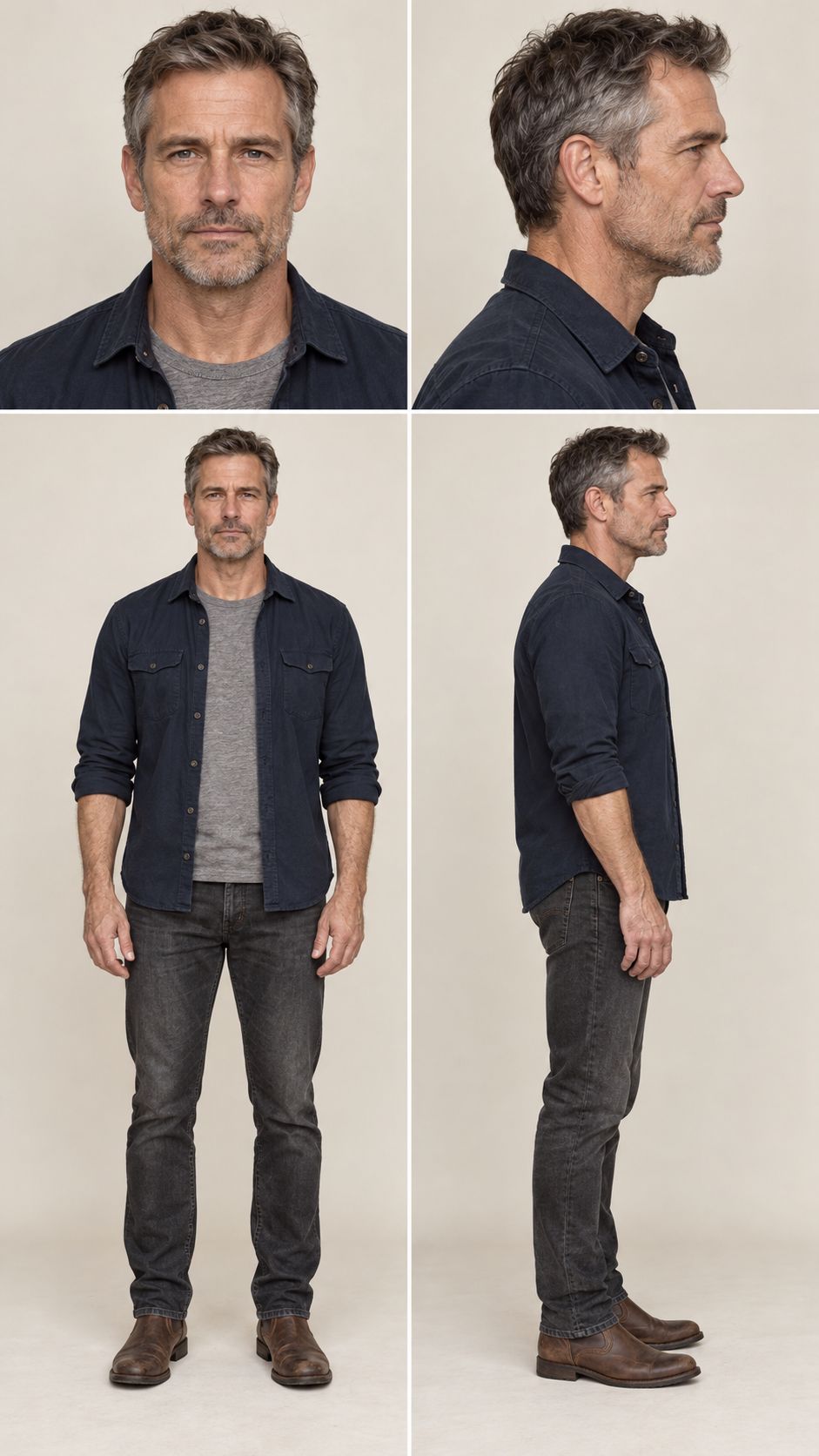
Case 2B — Generated once from text without a source image or post-generation image edits. Approximately 9:16, with the taller lower panels retaining the entire figure.
Actual generation prompt:
Create a photorealistic 9:16 portrait character reference sheet of one original Western man in his early fifties, with a rugged handsome face, short salt-and-pepper hair, gray-blue eyes, subtle forehead and eye wrinkles, and neat stubble. He wears a dark navy overshirt open over a heather-gray crew-neck T-shirt, charcoal straight-leg jeans and brown leather boots. Four unequal panels: upper left a front-facing head-and-shoulders portrait, upper right a true side-profile head-and-shoulders portrait; lower left full-body front, lower right full-body true side profile. The top row uses about one third of the page height, the bottom row two thirds. The exact same man, age, face, hair and outfit in every panel. Neutral expression, natural stance, level relaxed shoulders, hands at his sides, consistent body proportions. Full-body heads and boots completely visible, aligned feet. Plain warm off-white studio background, even soft light, realistic skin texture, clear facial detail. Narrow clean gutters. No text, logos, props or extra views.
One unchanged reference, one video-generation run
The sideburn area came out looking a little unnatural. Rather than repair it first, we kept the reference exactly as generated and sent it into the video test. So this case rests on one reference and one video request — no favorite picked from several attempts.
We picked Seedance 2.0 Fast to keep the 720p test cheap. It returned a roughly 12-second driving sequence in three shots: a medium shot in the cab, a side-profile close-up, and an exterior view of the truck. Lighting instructions stayed minimal — soft late-afternoon daylight, gentle shadows inside the cab.
Case 2C — One Seedance 2.0 Fast generation, 1280 × 720, approximately 12.1 seconds. The four-panel image above was supplied as the character reference, not as the opening frame.
Actual generation prompt:
Use image 1 only as the reference for the same middle-aged man, his face, salt-and-pepper hair, stubble and navy overshirt. Create a realistic 12-second sequence of him driving a red tractor-trailer along a quiet rural highway.
0-4 seconds: Inside the cab, front three-quarter medium shot. He watches the road and steers naturally, wearing his seat belt.
4-8 seconds: Cut to a close side profile of the same driver. Passing scenery moves outside the window.
8-12 seconds: Cut to an exterior tracking shot beside the truck, with the same man visible at the wheel.
Soft late-afternoon daylight, gentle shadows inside the cab. Keep the man, clothes and truck consistent. Natural engine and road sound, no dialogue, music or on-screen text.
Across the shots we inspected, he is recognizably the same man. The salt-and-pepper hair, the stubble and the navy overshirt all carry through the changes in framing. The side-profile close-up is where the beard texture and facial outline are easiest to check; the exterior shot keeps the overall identity, though the window hides most of the face detail.
Fast handled the scene well in a single run, stubble and all. The face shape still drifts slightly, and he reads marginally older than the reference. Treat this as one good example of cross-shot continuity, not as proof that a four-panel layout beats other references.
Three views with one larger portrait
The other option is to keep the body views you already have and add one neutral front portrait beside them.
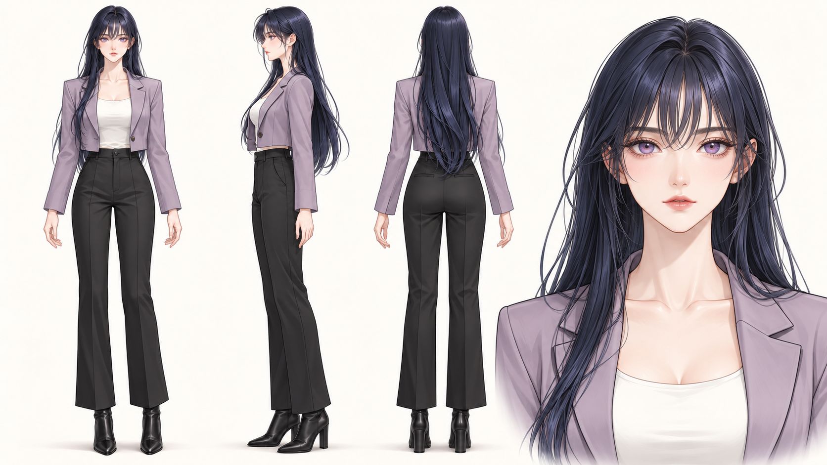
Case 3 — The face receives more space beside the three body views.
Actual generation prompt:
Using the attached image as the character identity and style reference, create a 16:9 landscape Korean webtoon reference sheet of this exact same adult woman. Preserve her face, violet eyes, midnight-blue long hair and wispy bangs, lilac cropped blazer, white top, black trousers and boots. Four clearly separated areas from left to right: full-body front, full-body side profile, full-body back, and a larger front-facing head-and-shoulders close-up. Match the scale and baseline of the three full-body figures, with every head and foot visible. Keep all expressions neutral. Plain warm off-white background, even light, no text or borders.
If an earring, a hair clip, a beauty mark or a collar detail is what defines the character, confirm it is visible at the size the reference will actually be used. For earrings, check shape, color, number and placement. Where needed, add a matching front portrait or a closer detail reference. Hair covering an ear still hides the earring, and enlarging a blurry body crop recovers nothing that was never captured.
4. Extra panels are information choices, not consistency upgrades
A complicated sheet does not hand the video model any extra ability to hold a character together. More views can make the input harder to read, especially when faces, outfits or accessories disagree with each other. Add the information the task needs and stop there.
Use detail panels for accessories and identifying features
An earring and a watch take up almost nothing in a full-body view. This variant keeps the three body views on the left and adds two close-ups on the right: the ear wearing the earring, and the wrist wearing the watch. At that size you can actually judge shape, material and placement.
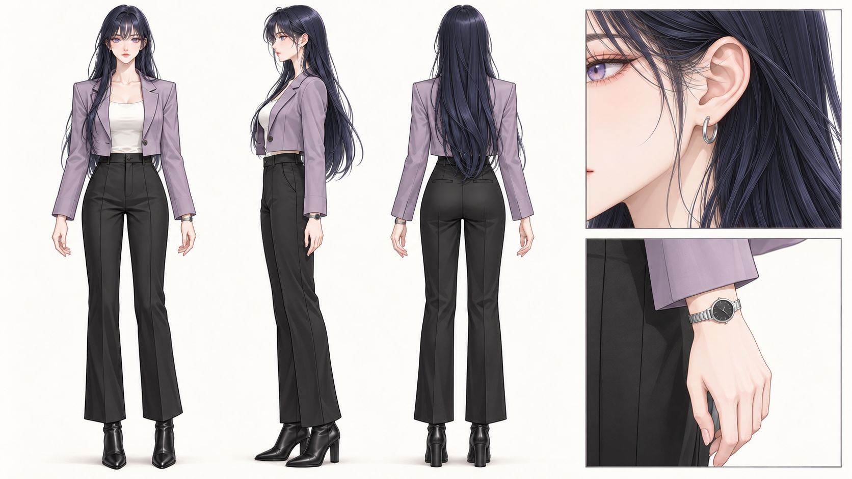
Case 4A — Generated once from the original character reference, adding silver hoop earrings and a silver watch with a dark round dial. The right-hand panels show the accessories being worn. These are new design additions, not details recovered by cropping the original image.
Actual generation prompt:
Use the attached image as the character identity, outfit and drawing-style reference. Create a 16:9 character detail reference sheet on a warm off-white background. Left two thirds: the same woman in full-body front, side and back views, equal scale, relaxed neutral stance, level shoulders, hands at her sides, all heads and boots visible. Preserve her face, violet eyes, midnight-blue hair, lilac blazer, white top, black trousers and boots. Add small silver hoop earrings and a slim silver wristwatch with a dark round dial on her left wrist. Keep these accessories consistent wherever visible. Right third: two large detail close-ups, upper showing her ear wearing the hoop earring with hair tucked aside, lower showing her wrist and hand wearing the watch just below the blazer cuff. Show the accessories worn on her body, matching the full-body views. Refined webtoon linework and soft shading, clean spacing, no props, text or extra views.
The close-ups supply design information that is invisible at full-body scale. Use them as a cross-check: do the accessories agree with the body views on side, shape and color? A neatly arranged sheet proves nothing by itself — the details still have to match.
When a character carries a lot of detail — tattoos, scars, iris color, a brooch, earrings, a watch — a four-panel reference can give the full body, the face and the key details room to be seen. Size each panel to its job: an eye close-up shows iris color, a local view shows the shape and placement of a tattoo or scar, an accessory close-up shows how a brooch or earring is built. Four panels do not have to mean four full-body angles, and they do not have to contain everything. Prioritize the features the current shot depends on that the body views cannot deliver.
A heavily detailed character remains hard for a video model. Close-ups give it a clearer reference to work from; they do not guarantee that every tattoo, scar or accessory survives motion, turns, occlusion and cuts. Being clear in the reference is not the same as being reproduced in the video. Watch the output for features that vanish or warp, sides that swap, colors that shift.
Additional angles
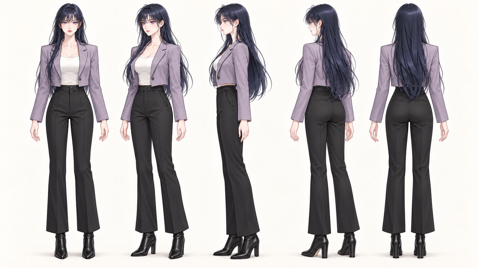
Case 4B — A generated five-angle variation.
Actual generation prompt:
Using the attached image as the character identity and style reference, create a 16:9 landscape Korean webtoon turnaround sheet of this exact same adult woman. Preserve her face, violet eyes, midnight-blue long hair and wispy bangs, lilac cropped blazer, white top, black trousers and boots. Show exactly five full-body views in a single row: front, front three-quarter, true side profile, rear three-quarter, and back. Rotate the whole body and head together through these angles. Same neutral expression, relaxed standing pose, body proportions and scale; feet on one baseline. Keep every head and boot visible with space between figures. Plain warm off-white background, even light. No text, borders or extra portraits.
A three-quarter view can show a transition that front and side leave ambiguous. It also adds another drawing to police — face shape, hair volume, outfit and posture all have to agree with the rest. Use the extra angle to answer a specific question; do not assume five views outperform three.
A combined expression board
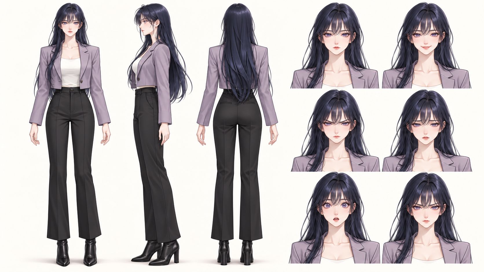
Case 5 — Three neutral body views plus six expression targets: neutral, warm smile, angry, sad, surprised and determined.
Actual generation prompt:
Use image 1 for the exact character, outfit and Korean webtoon style. Use image 2 only as a facial-expression reference, not its layout. Create ONE 16:9 landscape reference sheet on a plain warm off-white background. LEFT HALF: three matching full-body views in one row, front, side profile and back; neutral expression, same standing pose and scale, aligned feet, every head and boot visible. RIGHT HALF: six head-and-shoulders expression portraits in two columns and three rows. Reading left to right, top to bottom: neutral, warm smile, angry, sad, surprised, determined. Keep her facial identity, violet eyes, long midnight-blue hair, wispy bangs and lilac blazer throughout. Use a clear gutter between the full-body area and the expression area. No text, labels, borders or extra figures.
A board like this helps a person review the intended expression range. It does not follow that static expressions improve consistency in video, and nine depictions of the character spread across different angles and expressions can make it harder for the model to read the reference and pick the appearance it needs.
Ordinary expressions and acting belong in the video prompt — “pause, then give a restrained smile” — not as annotations on the character reference. Only reach for a separate expression reference when the performance is a heavily exaggerated anime reaction the model may misread, and confirm the model accepts that input first.
5. Keep bags, phones and other props as separate references
The next image sets a bag and a phone beside the character with short English labels — a presentation board for reviewing what a character carries.
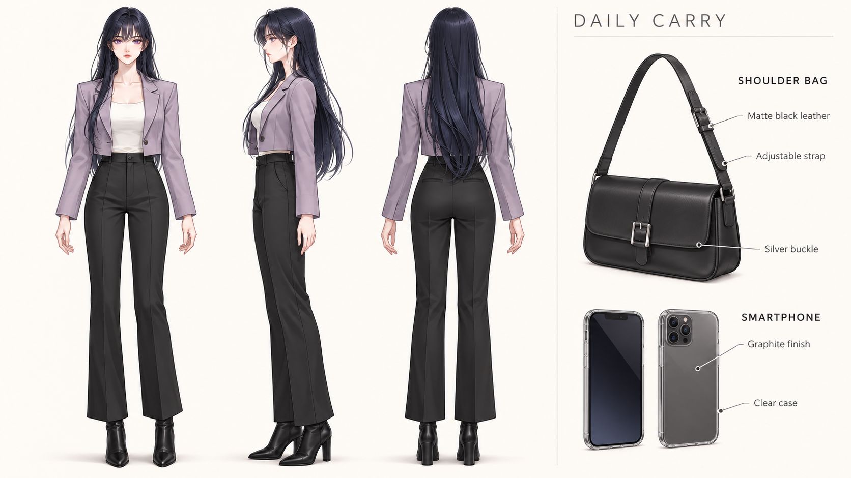
Case 6 — A character-and-prop presentation board.
Actual generation prompt:
Use the attached image as the exact adult character and Korean webtoon style reference. Create a professional 16:9 landscape character-and-prop reference sheet on a warm off-white background. LEFT TWO-THIRDS: her front, side and back full-body views in one row, same scale and neutral standing pose, all heads and boots visible. Preserve her violet eyes, long midnight-blue hair, lilac cropped blazer, white top and black trousers. RIGHT THIRD: separately display a compact black leather shoulder bag with an adjustable strap and silver buckle, and a graphite smartphone shown from front and back in a clear case. Keep the props off the character. Use refined editorial spacing, small clean English sans-serif labels and a few fine callout lines. Render exactly these texts: 'DAILY CARRY', 'SHOULDER BAG', 'Matte black leather', 'Adjustable strap', 'Silver buckle', 'SMARTPHONE', 'Graphite finish', 'Clear case'. Keep the labels near the corresponding objects and all text readable. Consistent delicate linework and soft cel shading. No brands, logos, dimensions, extra props or expression portraits.
For video generation, a simple character reference plus separate object images does more work than a packed board, wherever the tool accepts both. Keep bags, phones and handheld weapons off the main turnaround by default. Labels do not make a reference more consistent.
Give each item its own reference showing shape, color and defining details. Bring it in when the scene needs it, and say who uses it, how it is held or carried, and what happens. A phone should not end up in every appearance just because it once sat on a character board.
A sheath, holster, harness or permanent attachment worn as part of the approved outfit is character design, not a prop. If the workflow only takes a first-frame image, compose the character with the required object in that frame before animating. Separate reference images offer no guarantee that the interaction will come out right.
6. Generate and manage character variants separately
Build a new outfit asset from the approved character reference: keep the identity and the body design, swap the clothes across the views you need, then review the result as a version in its own right.
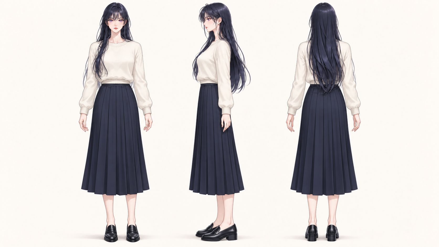
Case 7 — A reference-guided outfit change from the original three-view sheet. The target outfit is a cream knit sweater, navy pleated midi skirt and black loafers.
Actual generation prompt:
Use the attached three-view sheet as the character identity and composition reference. Change only the outfit across all three views to a cream crew-neck knit sweater, a dark navy pleated midi skirt ending at mid-calf, and black leather loafers. Preserve the same adult woman's face, violet eyes, long midnight-blue hair, wispy bangs, body proportions and Korean webtoon style. Keep the full-body front, side profile and back views in the same order, at the same scale and in the same relaxed standing pose, with aligned feet and every head and shoe visible. Make the new clothes consistent across the three angles, including sweater neckline, sleeve length, skirt waist, pleats and hem height. 16:9 landscape sheet, plain warm off-white background, even light, delicate linework and soft cel shading. No text, props, extra views or old outfit pieces.
Check that she still reads as the same person, and that neckline, sleeves, waist, pleats, hem and shoes agree across the three views. This is a generated outfit variation, not a measurement of how well identity survives.
Treat age stages and outfits as managed assets
Generate, review and save each outfit and each age stage on its own, all under the same character identity. Every version needs its own approved reference. For an age change, review the appearance and proportions that suit that stage instead of mixing several ages onto one model-facing sheet.
Store the character ID, age stage, outfit name, version number, draft-or-approved status, reference files, source image and the actual prompt together. Names along these lines:
| Example asset name | Meaning |
|---|---|
character-01_adult_workwear_v01 | Adult character in the original workwear outfit |
character-01_adult_casual_v01 | Adult character in a separately reviewed casual outfit |
character-01_older_casual_v01 | Naming example for an older stage, requiring its own approved design |
For each scene, pick the approved age, outfit and appearance-state version, with head and body references that match each other. Add objects separately. All of this is a convention for reuse and revision — it will not make the model consistent on its own.
Keep appearance changes as subsets of the same character
When a character acquires a scar or another lasting change, generate a new reference from the approved design, review it, and save it as a separate subset under the same character ID. Keep the original for scenes set before the change.
character-01_adult_casual_baseline_v01 and character-01_adult_casual_after-injury_v01 might describe the same person before and after an injury. Record the new subset's parent reference, its appearance state, and the story stage it applies to. These are naming examples only; no extra assets were generated for them.
For a scar, sign off on its shape, color and position as the character would experience it. Make it readable in a close-up, and keep it consistent wherever it shows in the other views. Choose the matching subset per scene, and do not send pre-injury and post-injury references together as competing identities. A short line in the prompt can name the state; the approved image records what it looks like.
Summary
Read the references as a set before you use them. Do all the views describe the same person? Is the stance natural? Do the clothing and the small details agree? Can you actually see what the intended shots need? Approve one design, then choose between a standard turnaround and a four-panel layout that gives the face more room.
| What you need | Reference to consider |
|---|---|
| Full-body silhouette, clothing and back design, with the face still readable | A standard front, side and back turnaround, a useful starting point for motion comics and stylized 2D |
| Frequent close-ups or greater emphasis on facial features, hairline, stubble or skin detail | Unequal four panels with front and profile portraits above front and profile body views, for more detailed photorealistic, film-oriented or 3D-style work |
| Both the back design and a readable face | Keep the three-view sheet and add a matching front portrait; supply the relevant reference for the shot instead of forcing everything onto one page |
After choosing the layout, check the following:
| Check | What to review |
|---|---|
| Posture and proportions | Level, relaxed shoulders, upright head and hands at the sides; matching body and limb proportions across views |
| Face and identifying details | Readable features, hairline, accessories and scars; asymmetric details remain on the character’s correct side |
| Version and use | Age, outfit and appearance state belong to one approved version and match the story stage and shot |
| Enough information | The design needed for the current shot is visible; extra angles, expressions and objects have a specific purpose |
What you want is a clear, internally consistent reference that is easy to reuse — not a panel count. Generate real shots, inspect them, and add the information that turns out to be missing. Three views or four panels, the test is the same: do the face, the clothing and the key details hold up in the video?
Arcloop now covers the whole character design workflow. Try the AI Character Generator.
FAQ
Do I need to design the front, side and back separately?
No. Describe the whole character and generate the views in one pass. State any special side or back requirement in the prompt, then review all the views as a single design.
Is a four-panel sheet better than a three-view sheet?
Different, not better. The four-panel example gives the face more space and drops the back. Choose by the information the task needs; nothing here shows a universal winner for video consistency.
Can I mirror a side view?
Check hair, earrings, scars, pockets and straps before you do. Mirroring an asymmetric character moves every one of those details, so use a corrected or separately generated view instead.
Does a turnaround guarantee consistent video?
No. The video model still has to read the references, hold the identity and generate the action. Make the important details readable, feed the reference in the mode the tool expects, and judge across repeated results rather than a single good clip.